Data Integration E2open
Overview
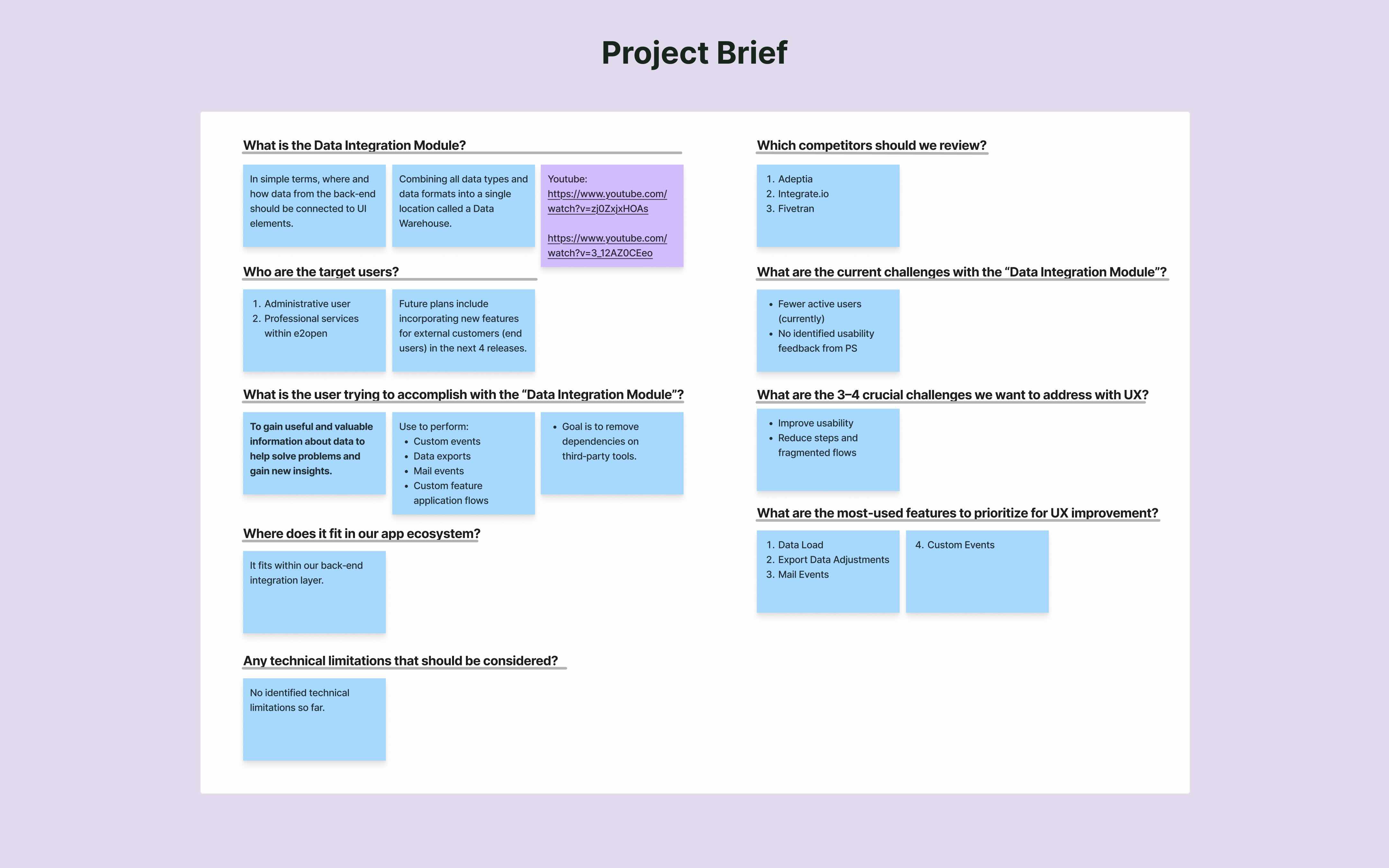
The Data Integration feature enables teams to connect and manage data from multiple enterprise systems in one place. Within e2open’s Sales & Operations Planning suite, it provides a reliable data foundation that helps planning teams make informed decisions across supply, demand, and execution.
My contribution
User research User experience Product design
The team
1 × product designer 1 x project manager 2 x developers
Year
2026

Challenge
The core challenge was rethinking a legacy system to better support complex workflows and user expectations, with a focus on two key priorities:
- Modernizing the legacy 'Harmony' design system by upgrading to its next iteration, 'Modern Harmony'.
- Improving usability and reducing setup friction through more predictable interactions.
Solution
The redesign treats data integration as a cohesive system, not a collection of screens. Clear structure, task‑efficient flows, and meaningful feedback help users confidently set up, monitor, and manage complex integrations.
Empathy
Domain Context
Before jumping into design, I collaborated with internal SMEs to understand the end‑to‑end behavior of data integration within the planning suite and its constraints.
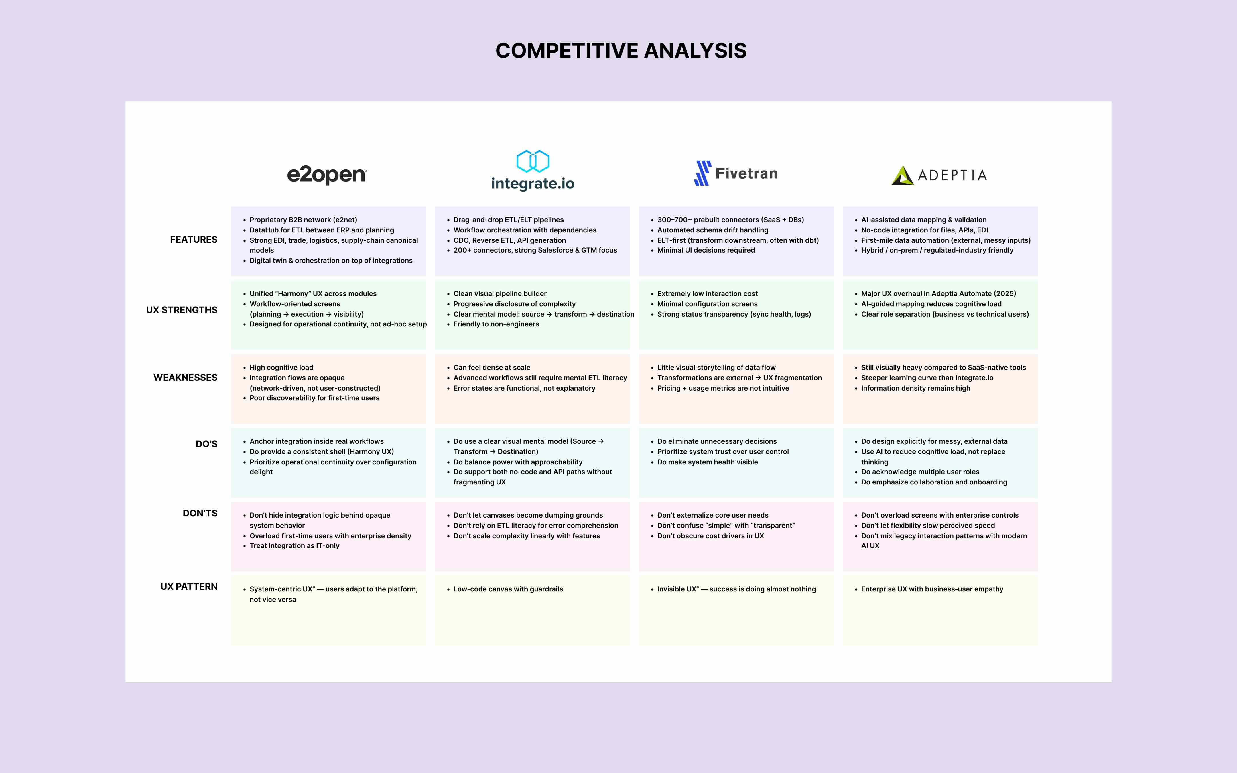
Competitive Analysis
While competitors focus on fast, template‑driven integrations, they often fall short in supporting complex enterprise workflows. By addressing this gap, e2open can deliver a more scalable and usable integration experience.


User Interviews
Rather than asking “what’s broken,” I explored how users make sense of complexity. The interviews focused on moments where the product should guide, reassure, or explain, so the experience feels predictable instead of procedural.
Participant Profile
- 3 participants
- Target users: Professional Services, Administrators
- Interview Mode: Microsoft Teams Video calls
- Format: Semi‑structured interviews
- Length: 30–45 minutes each
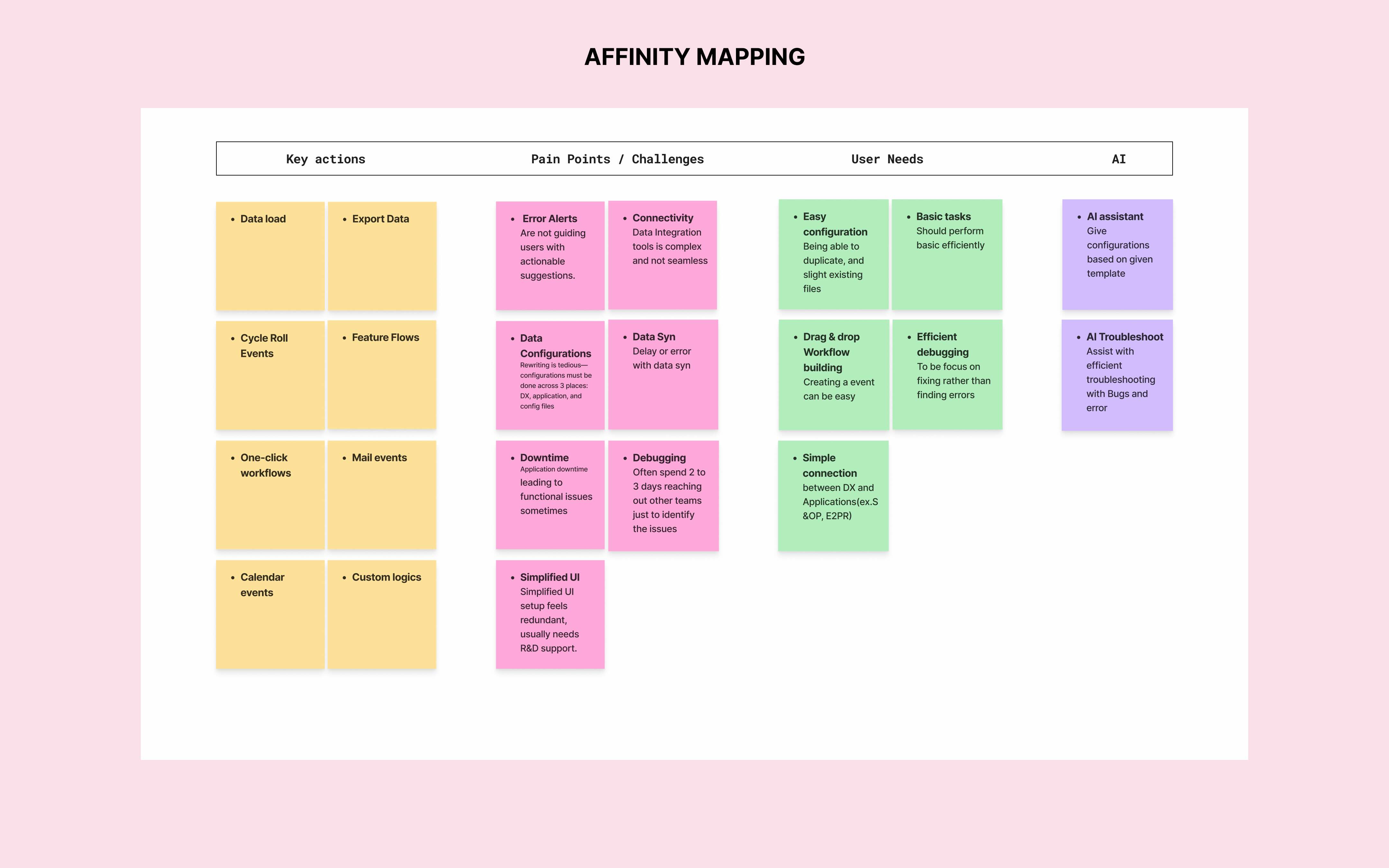
Interview Findings
- Users want easier connectivity between DX and downstream apps (e.g., planning/execution modules).
- Navigation across setup and automation feels fragmented, slowing task completion.
- Limited visibility into system status makes monitoring feel uncertain.
- Users rely on workarounds because reuse/duplication isn’t built into the core workflow.
- When something breaks, users often wait 2–3 days for external help to pinpoint the cause and unblock work.


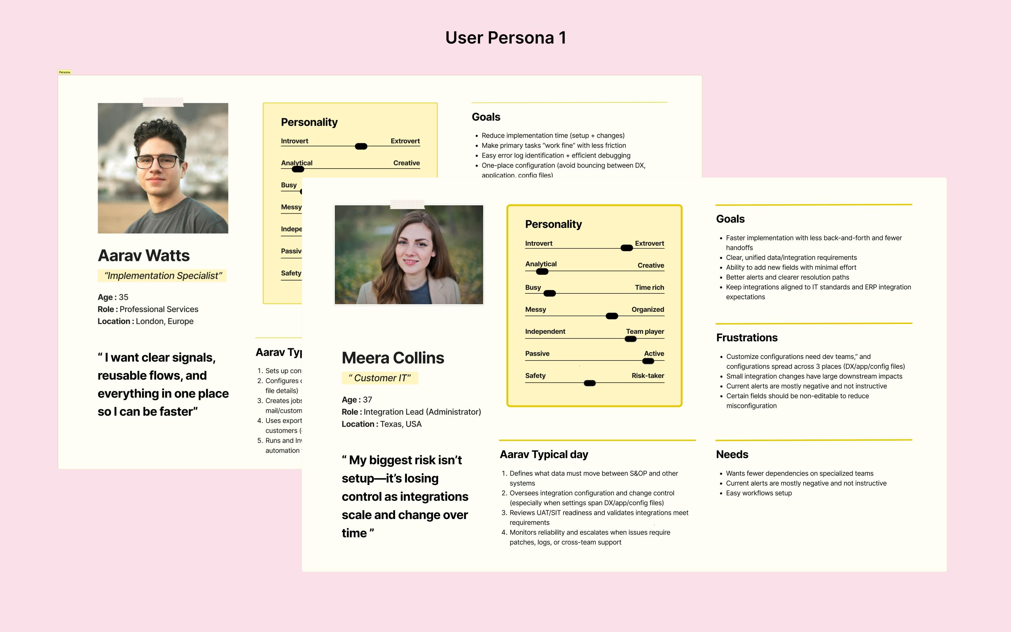
User Persona
The research revealed that the same workflow feels different depending on who owns it. I created two personas to reflect that split: implementers who measure success by time‑to‑go‑live, and administrators who measure success by stability, governance, and fewer escalations.
Define
Defining the Problem
Research made it clear that integration work breaks down when users can’t predict what the system will do next. The real problem isn’t complexity—> it’s uncertainty, especially during setup and troubleshooting.
How might we make complex integrations feel predictable and user‑controlled from setup to monitoring?
To answer this, I concentrated on two core questions that would shape the solution:
- What signals and feedback help users understand “what’s happening” at every step?
- How do we make troubleshooting actionable inside the product, not a support ticket?
Framework
I mapped the end‑to‑end journey to pinpoint the moments where confidence drops and users “lose the thread.” Then I broke down the most frequent jobs into steps to expose loops and context switching, which directly highlighted where the workflow needed simplification.


Ideate
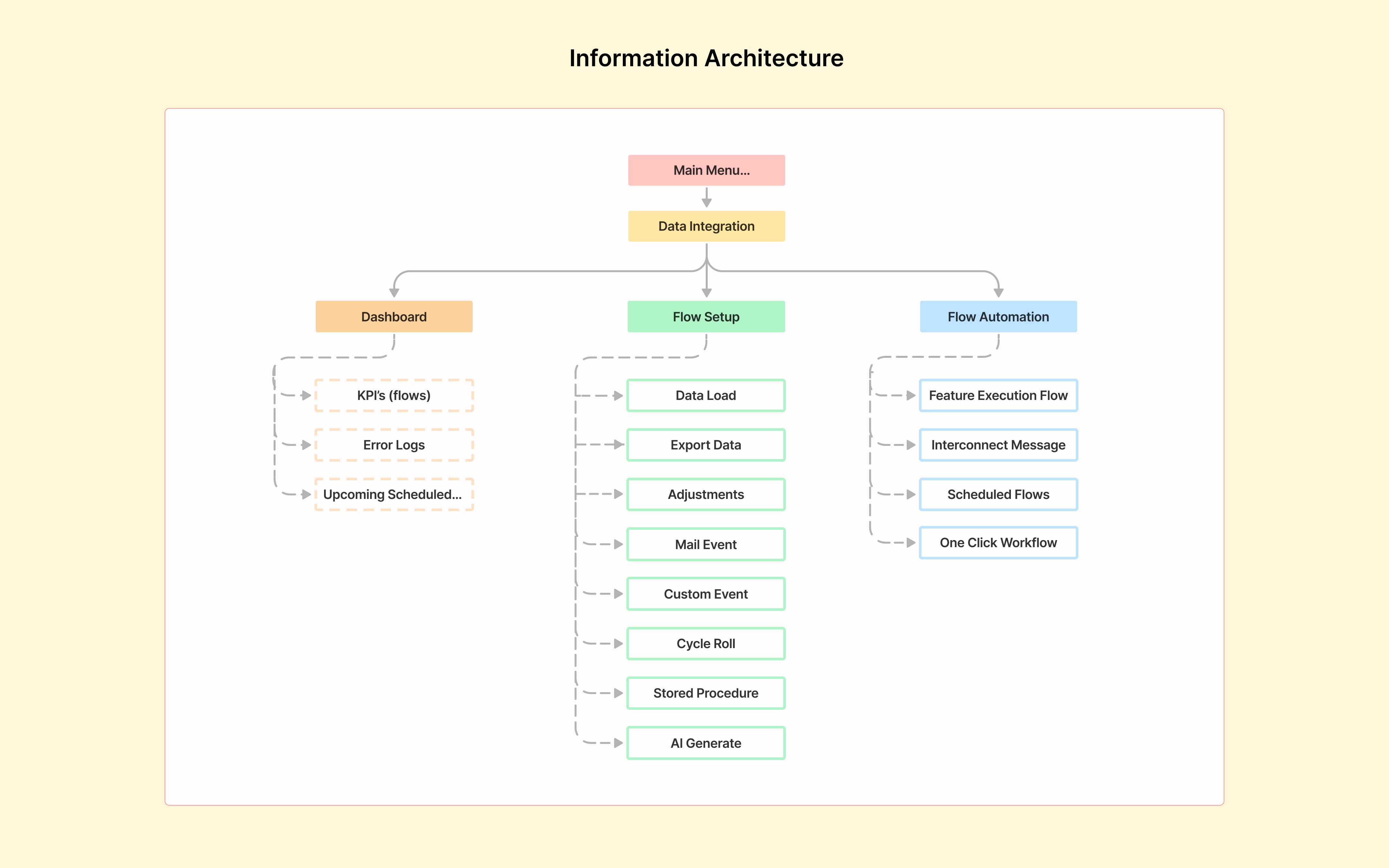
Information Architecture
Users don’t think in pages, they think in stages:
Connect a source → Configure rules → Validate → Automate → Monitor
The IA redesign mirrors that mental model, using clearer labels and structure to reduce guesswork and keep users oriented throughout the workflow.
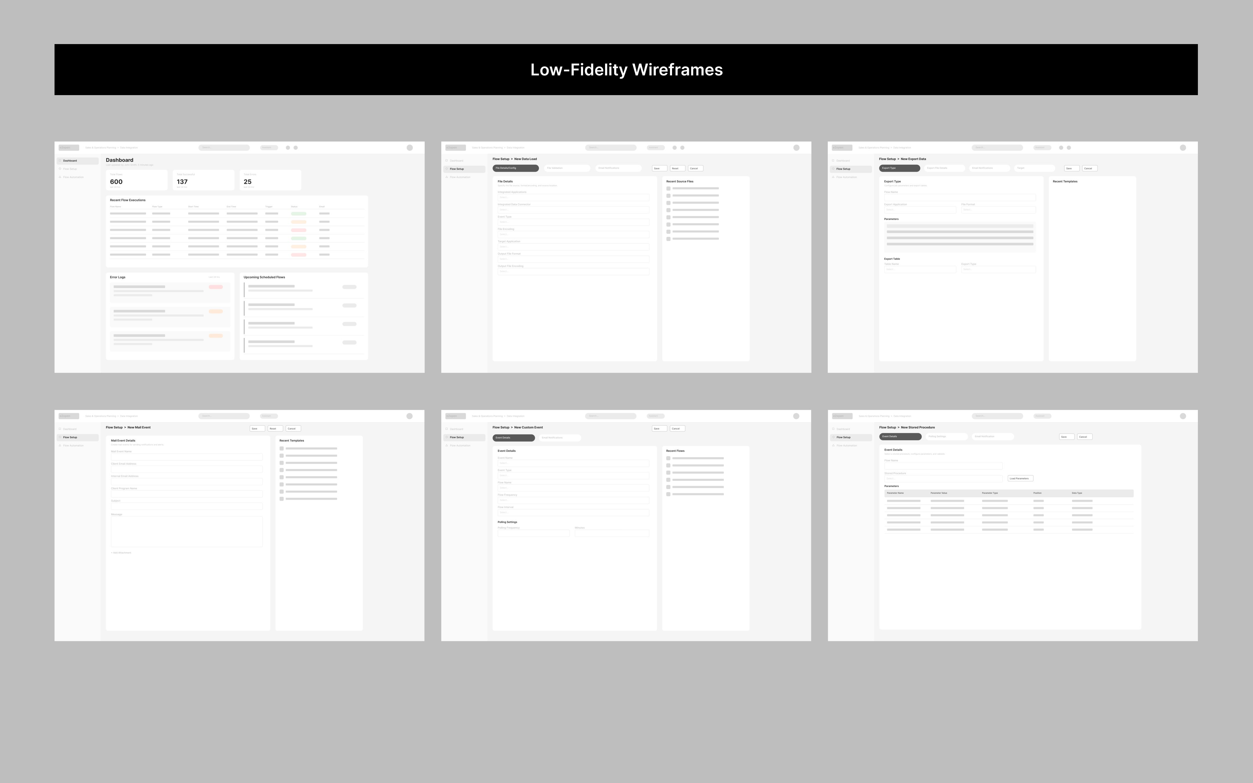
Lo-Fi Wireframes + AI
I used Claude AI to quickly sketch out wireframes and test different layouts across all screens before moving to high fidelity.

Prototype
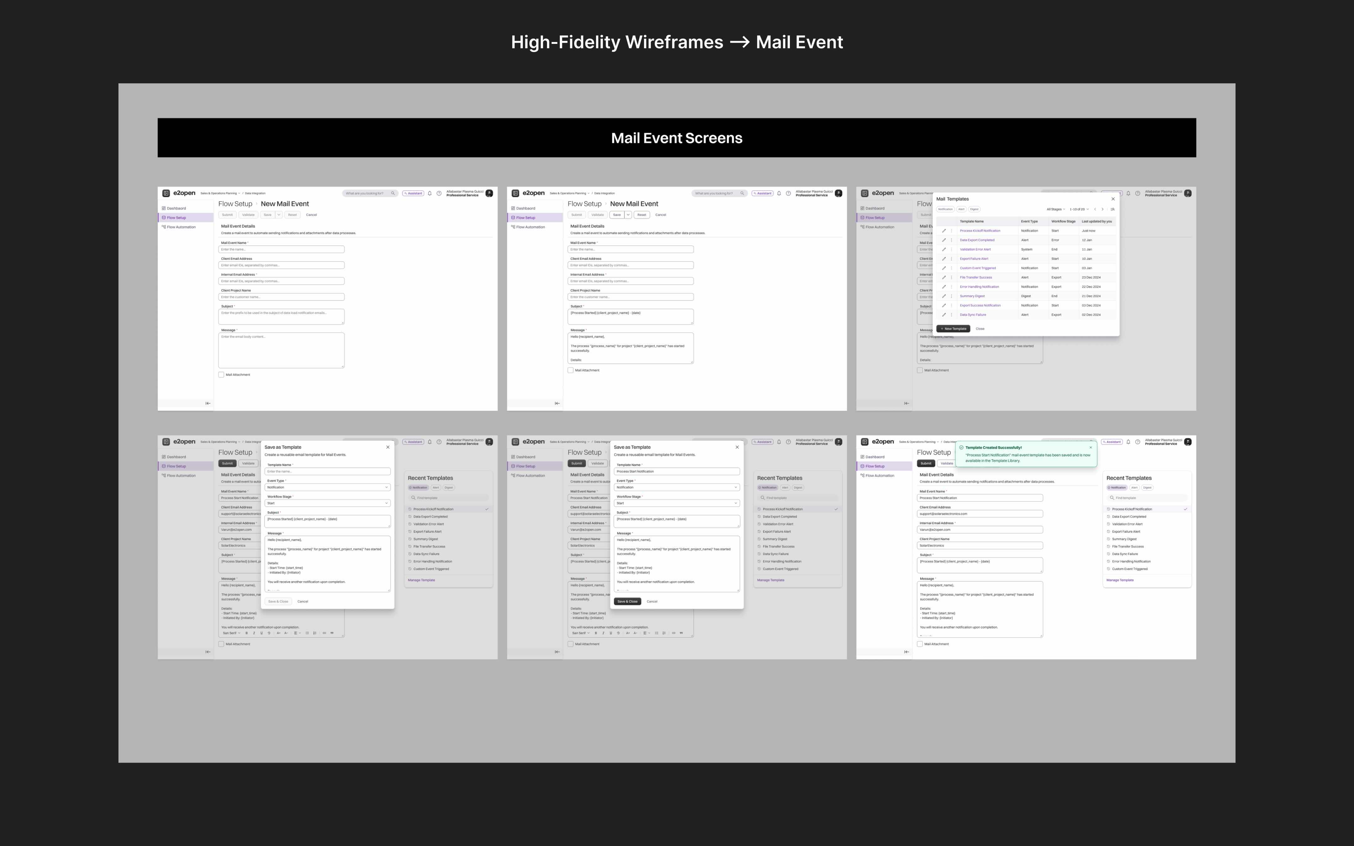
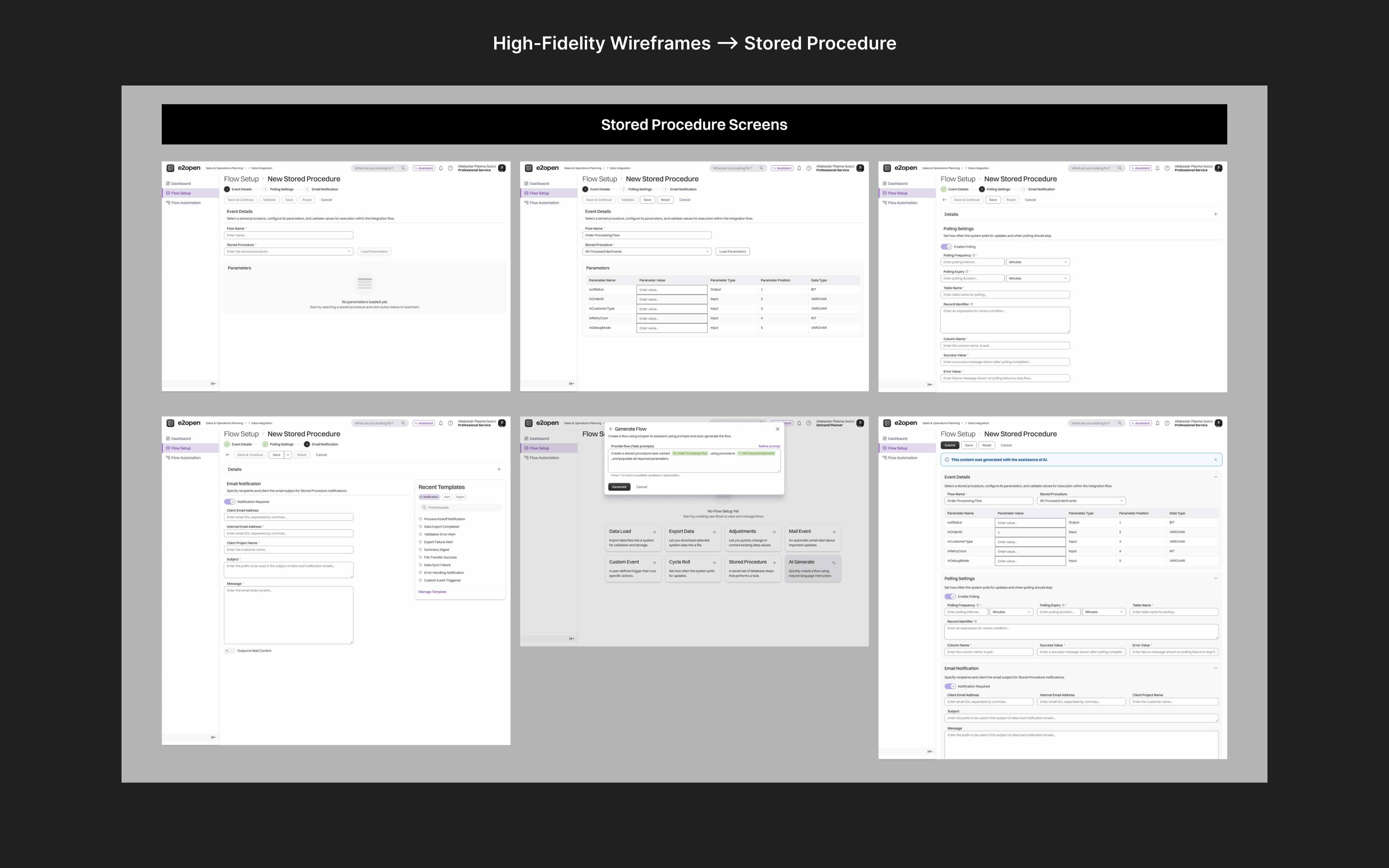
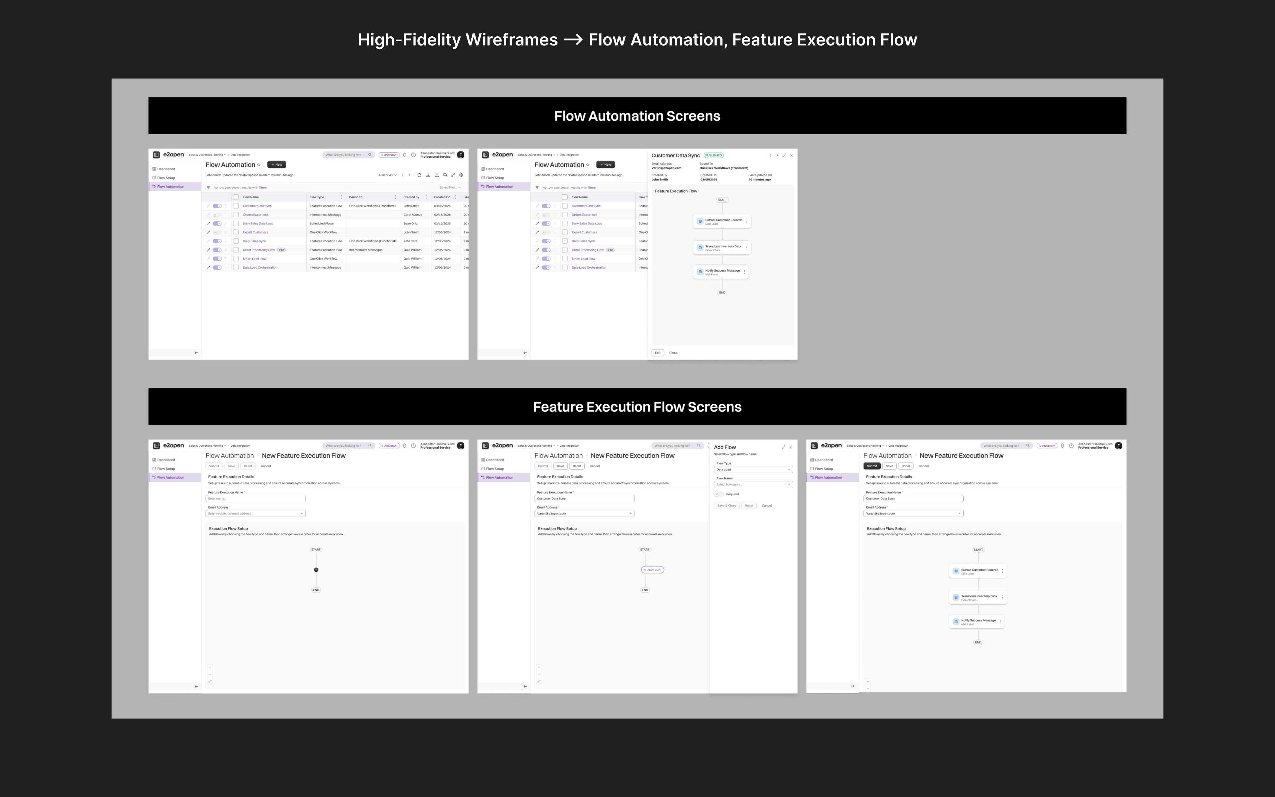
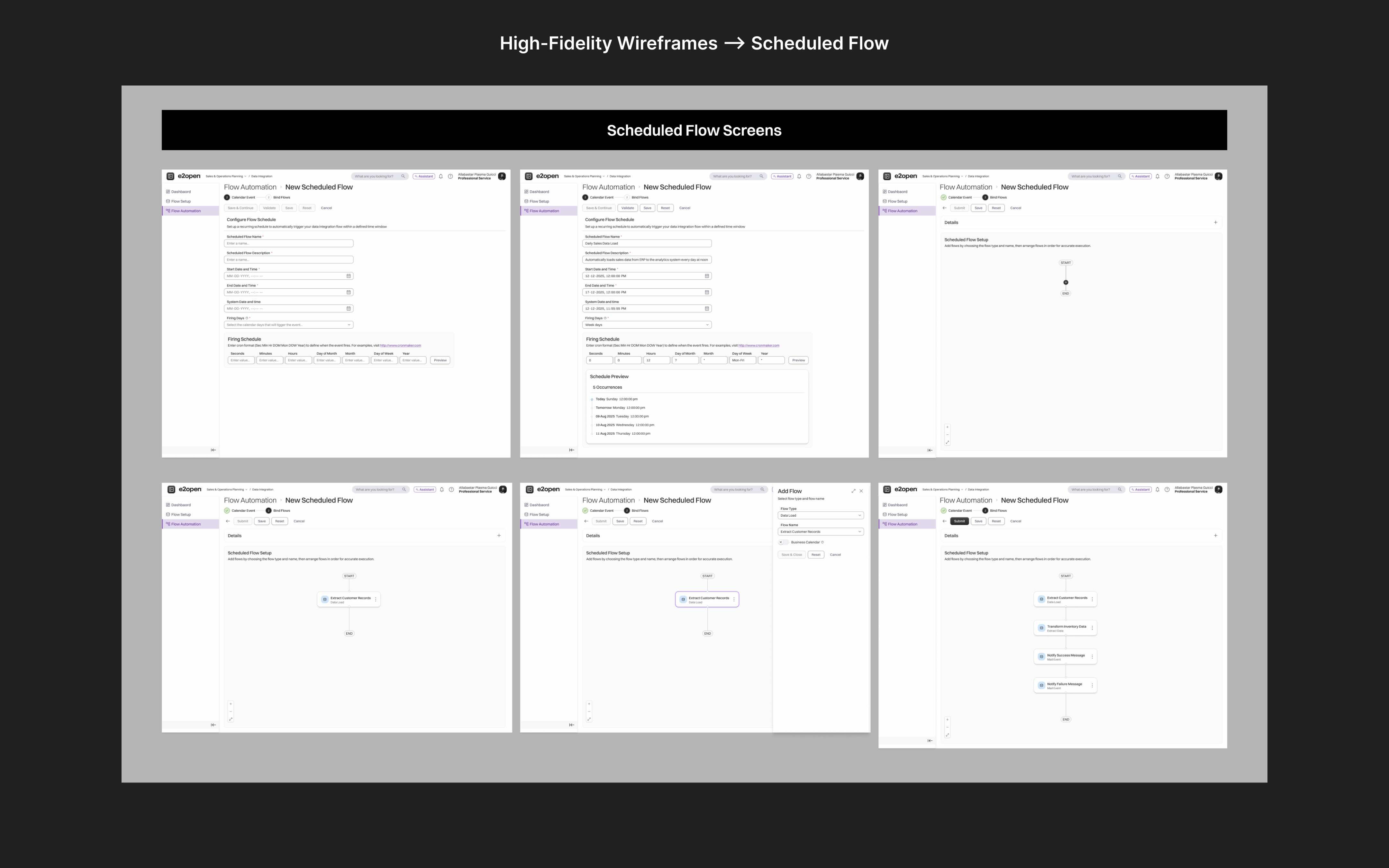
Hi-Fi Wireframes + Figma
The designs directly address the uncertainty and fragmentation users reported every screen answers "what's happening" and "what do I do next."
- One configuration UI eliminating the DX/Application/Config file switching
- Dashboard with flow KPIs, error severity, and upcoming schedules at a glance
- Stepper navigation guiding users through multi-step setup
- Drag-and-drop flow builders for predictable automation
- Modern Harmony design system ensuring visual and interaction consistency


Test
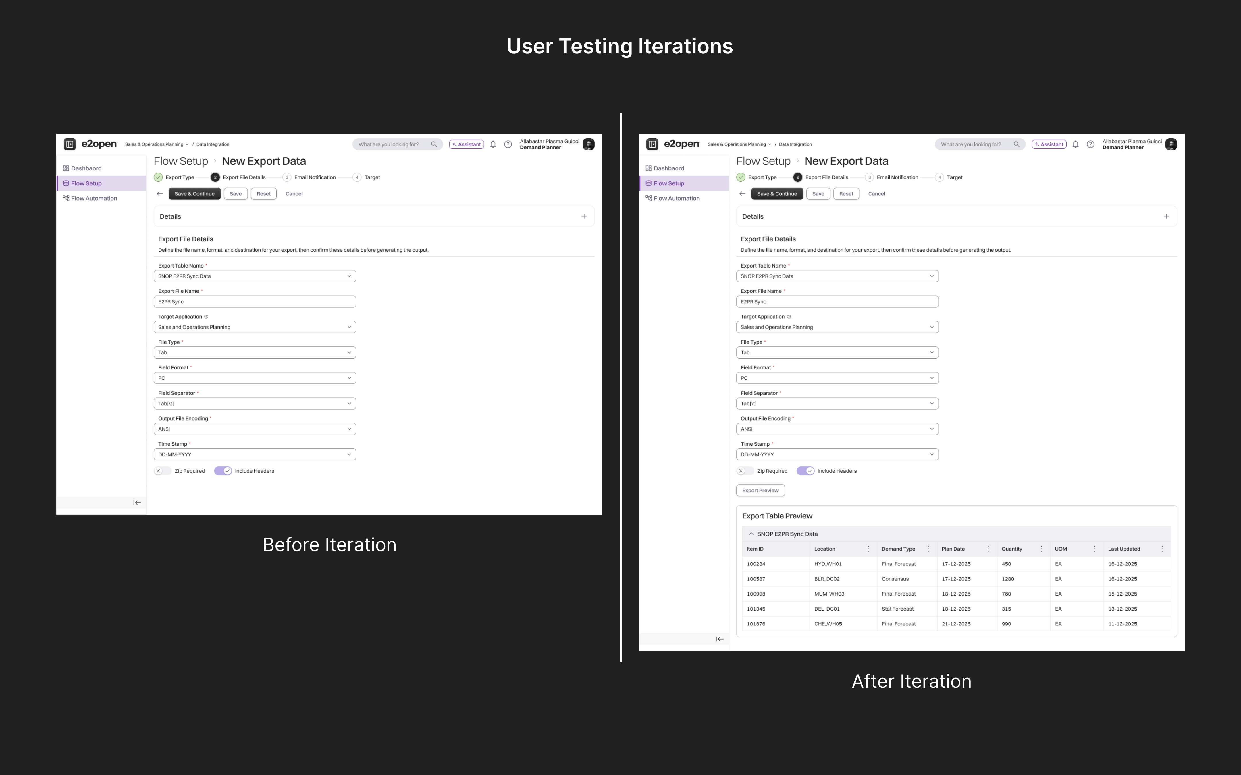
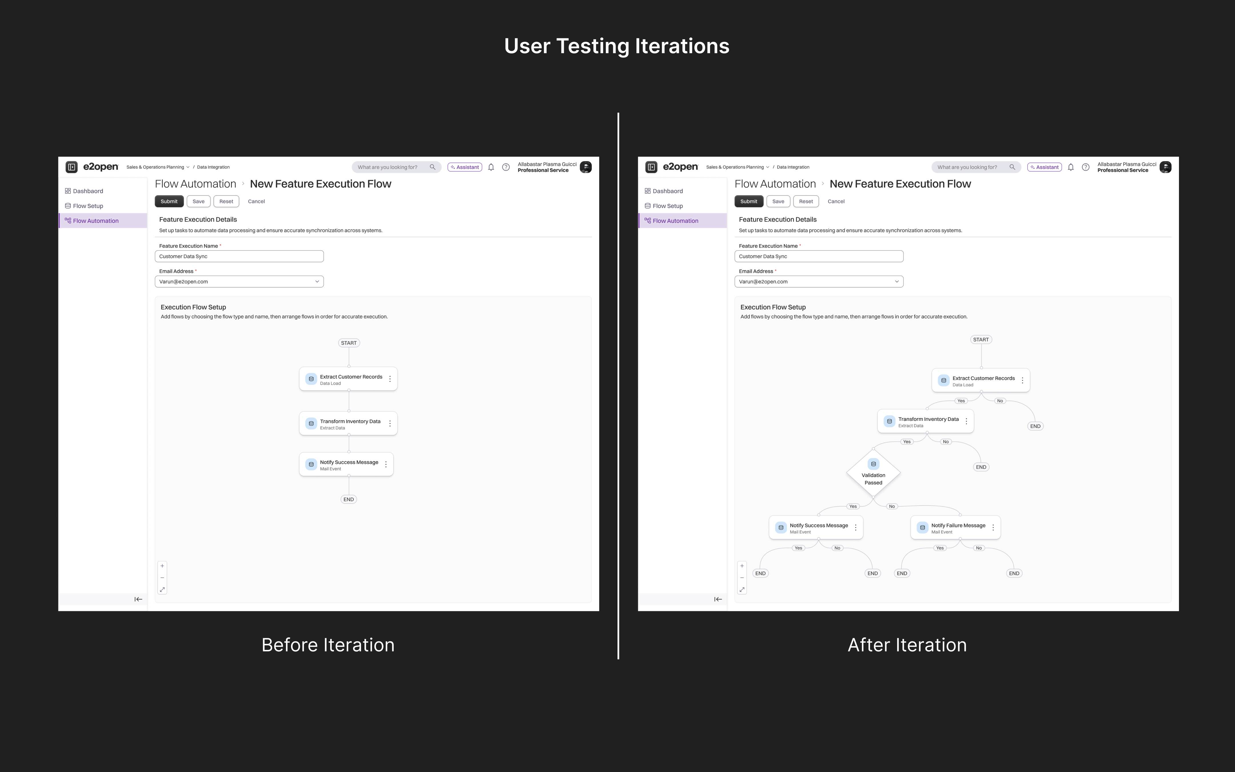
Usability Testing
Testing with the 'Professional Services team' showed gaps I couldn't spot in static designs. Every iteration came directly from what I observed during testing.
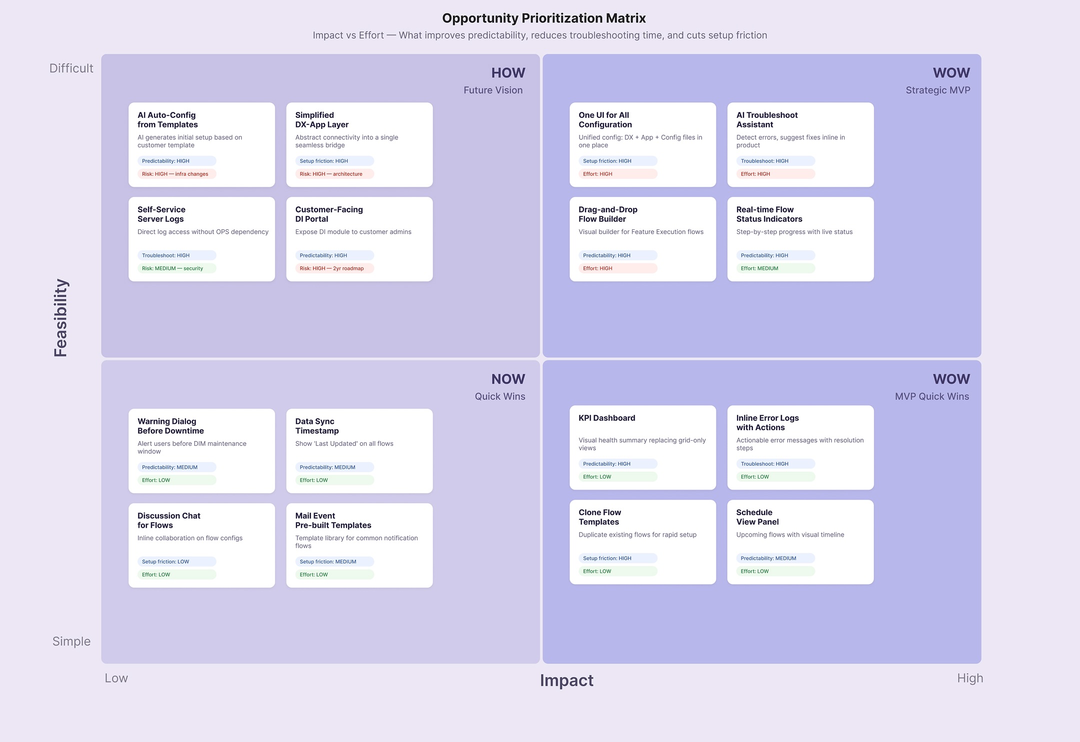
Opportunities:
- Users wanted to preview their data before exporting
- Reuse templates instead of creating mail events from scratch
- Build flows with branching logic — not just a straight line
Where I Landed
What started as a legacy modernization became a fundamental rethink of how users interact with data integration. The final designs reflect multiple rounds of refinement informed by 'Professional Services team' usability feedback. The result is a cleaner, more predictable workflow that improves
——> setup, validation, automation, and recovery.