Ecrayon
Overview
Ecrayon is Virginia’s leading e-learning platform, successfully bridging the gap between learners and institutions for secondary and higher education.
It offers diverse educational content to assess, evaluate, and upskill in domains like Aptitude, Communication, and Employability.
My contribution
User research User experience design
The team
1 × user experience designer 2 × engineers 1 × product manager
Year
2023
Challenges
With a diverse user base, the platform needed to present educational content clearly and effectively. It also needs to improve access to resources and enhance communication to motivate students and keep them engaged throughout their Self-learning journey.
Solution
A user-centered redesign focusing on simplifying navigation, monitoring progress, and content management. I conducted methodologies such as user interviews, surveys, and usability testing to gather valuable insights that informed the design decisions and address the key challenges.

Empathy
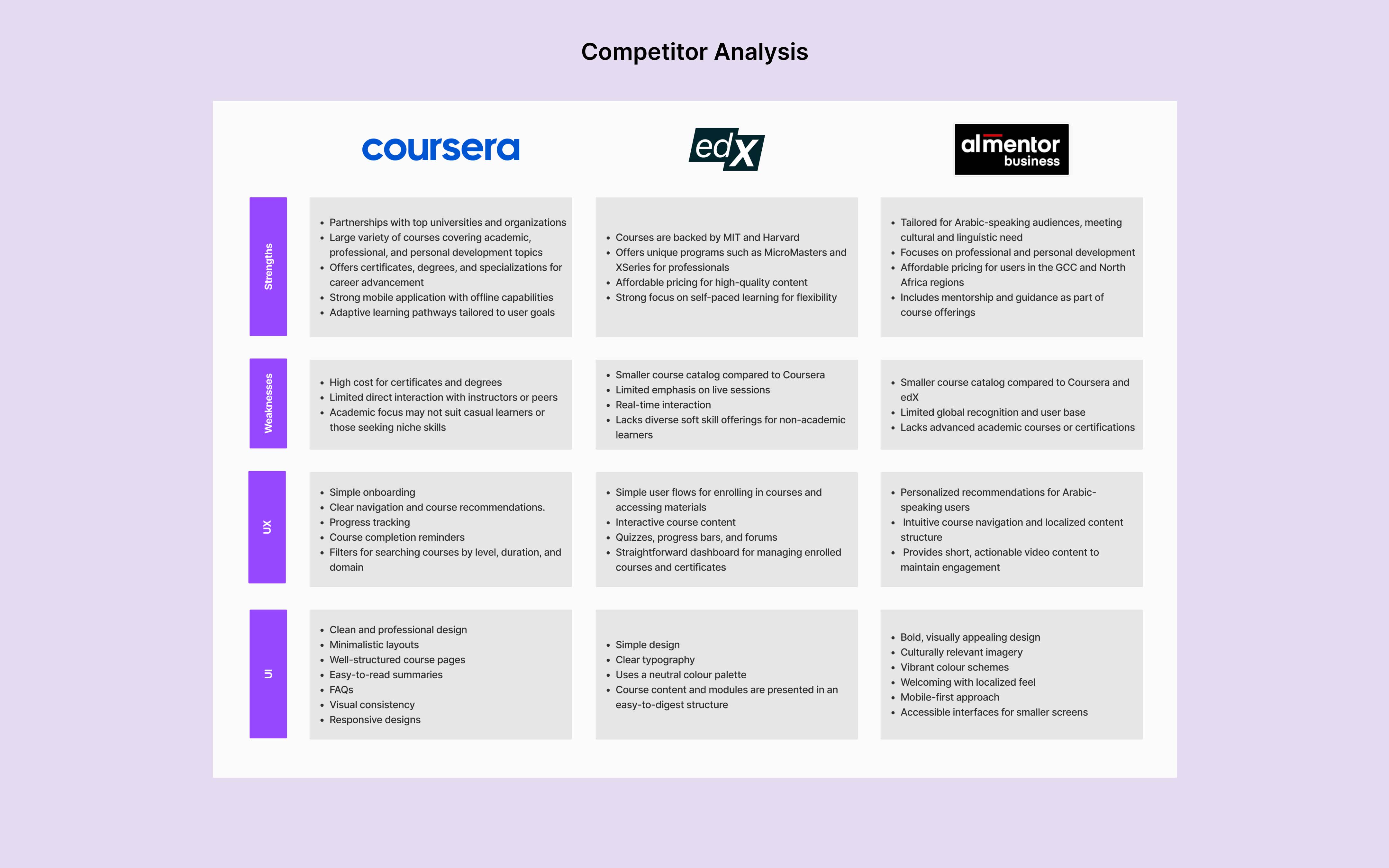
Competitor Analysis
Compared to global platforms like Coursera, edX, and almentor. Ecrayon faces challenges in brand recognition, course variety, and scalability. Despite offering a functional dashboard, its UI could be enhanced with more modern and interactive elements to stay competitive in the e-learning market.
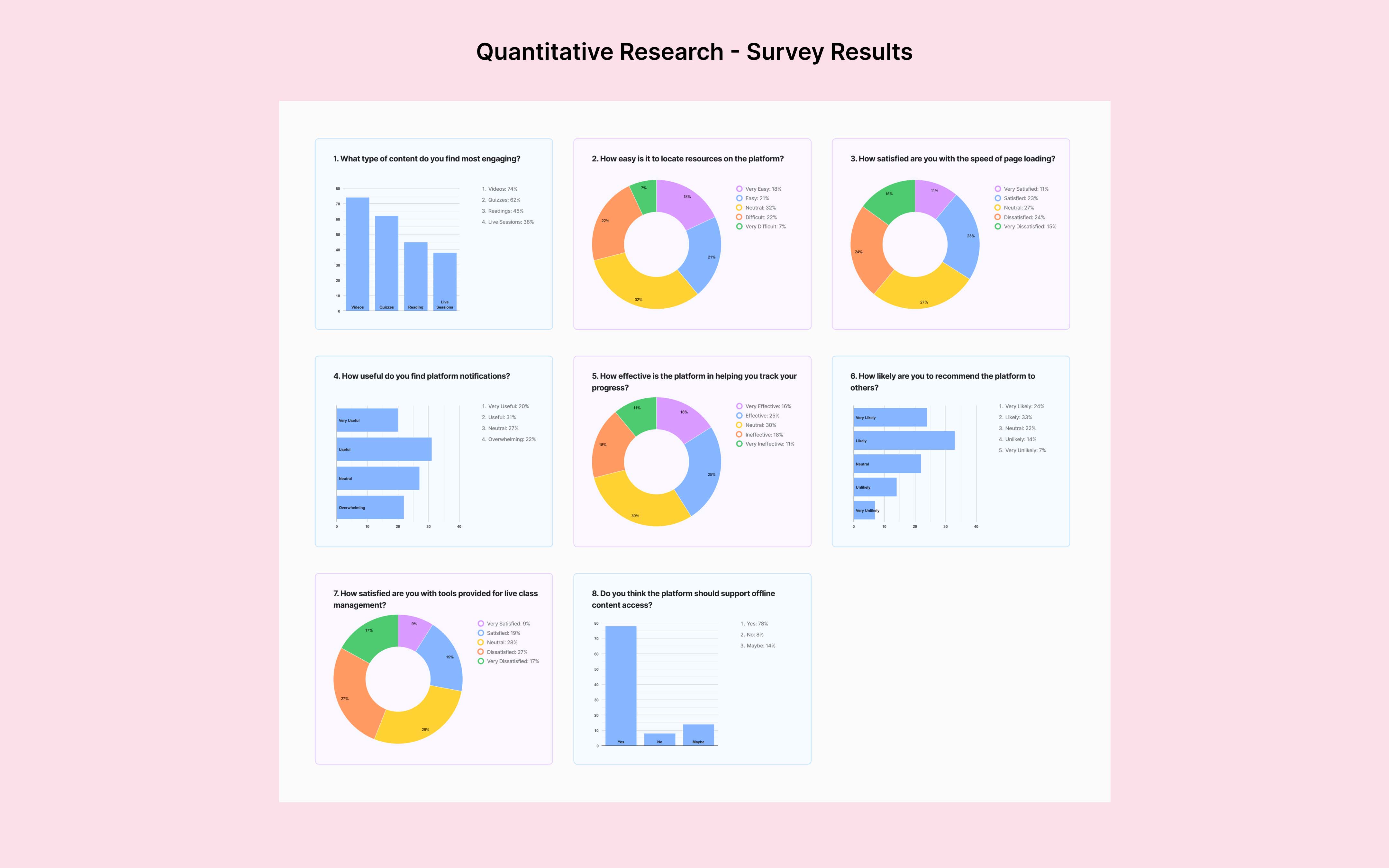
Quantitative Research (Survey)
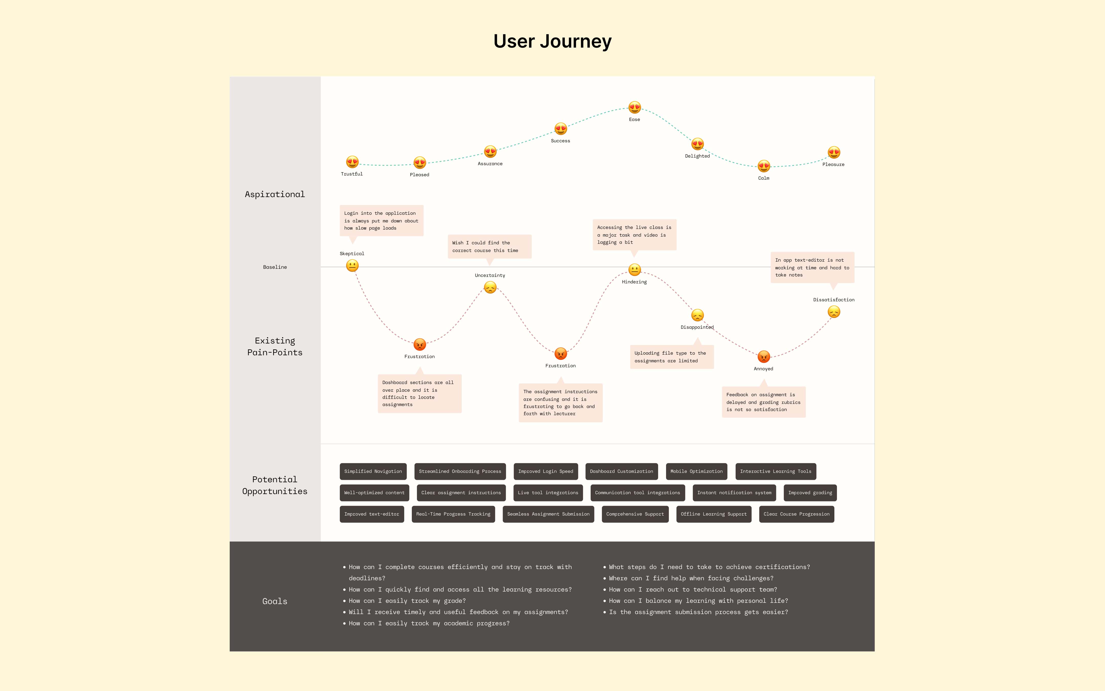
A survey of 34 university and high school students revealed key insights into the eCrayon platform. Videos and quizzes were the most engaging content, with 78% requesting offline access. However, challenges like poor navigation and slow page speed (35% satisfaction) highlight areas for improvement.
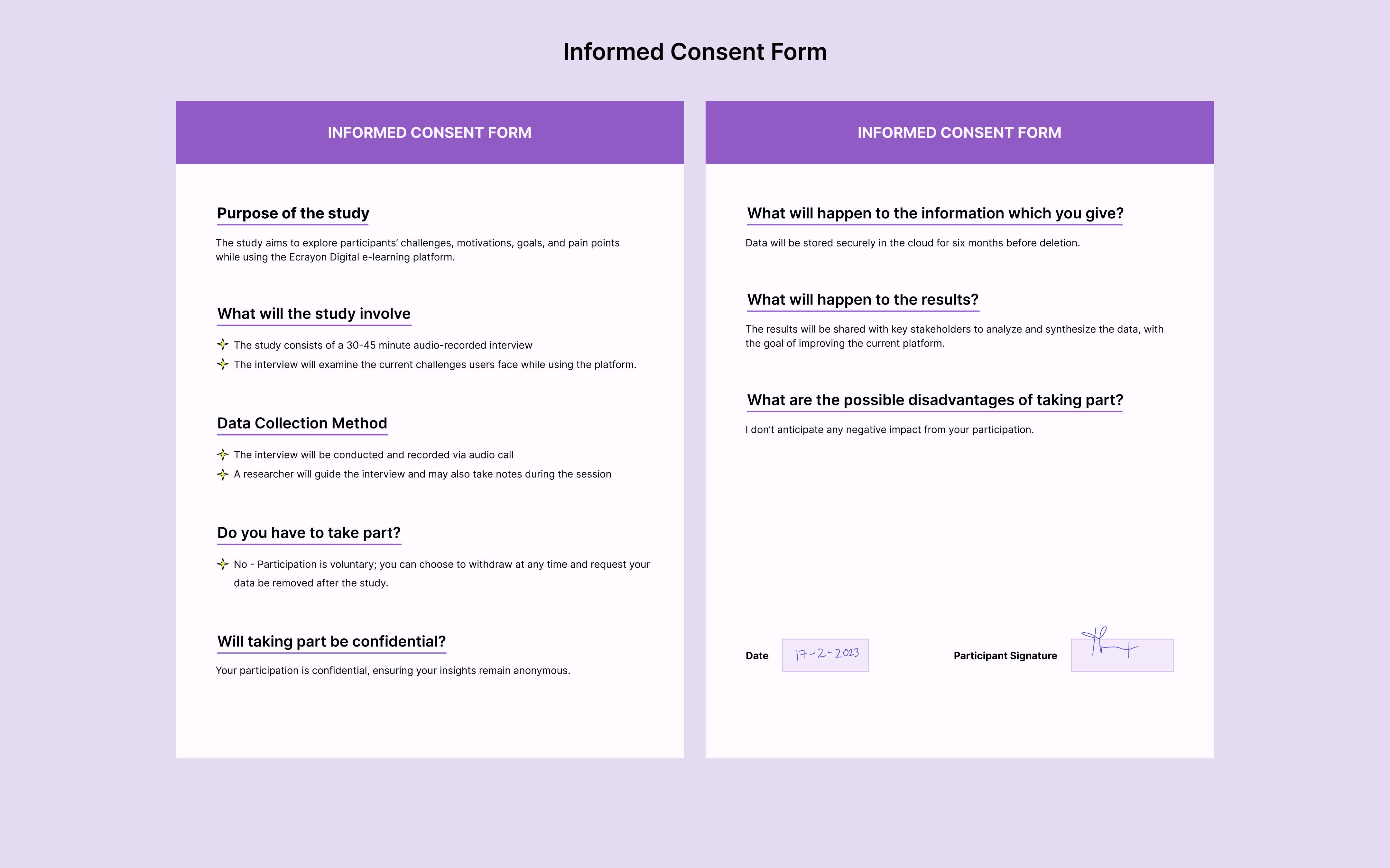
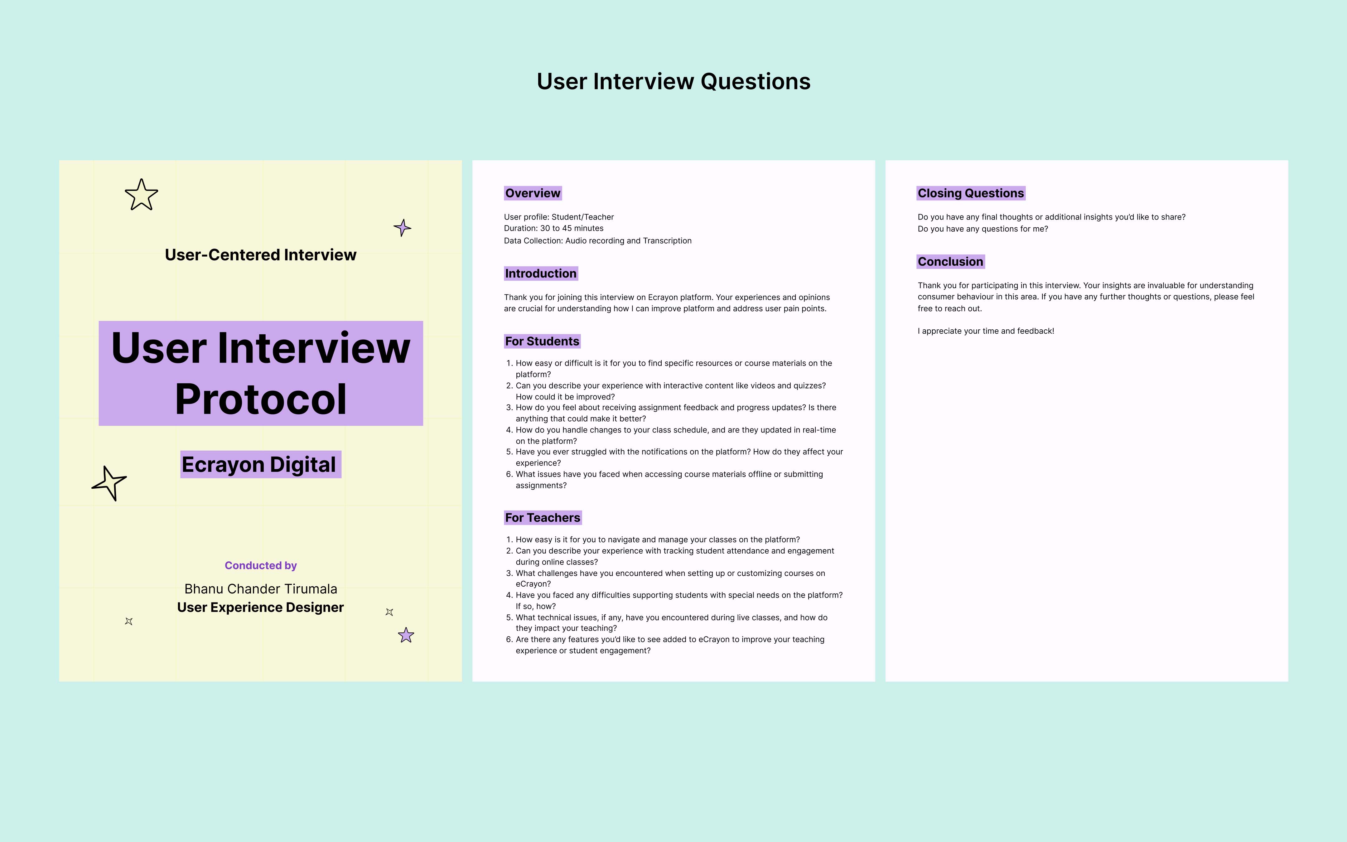
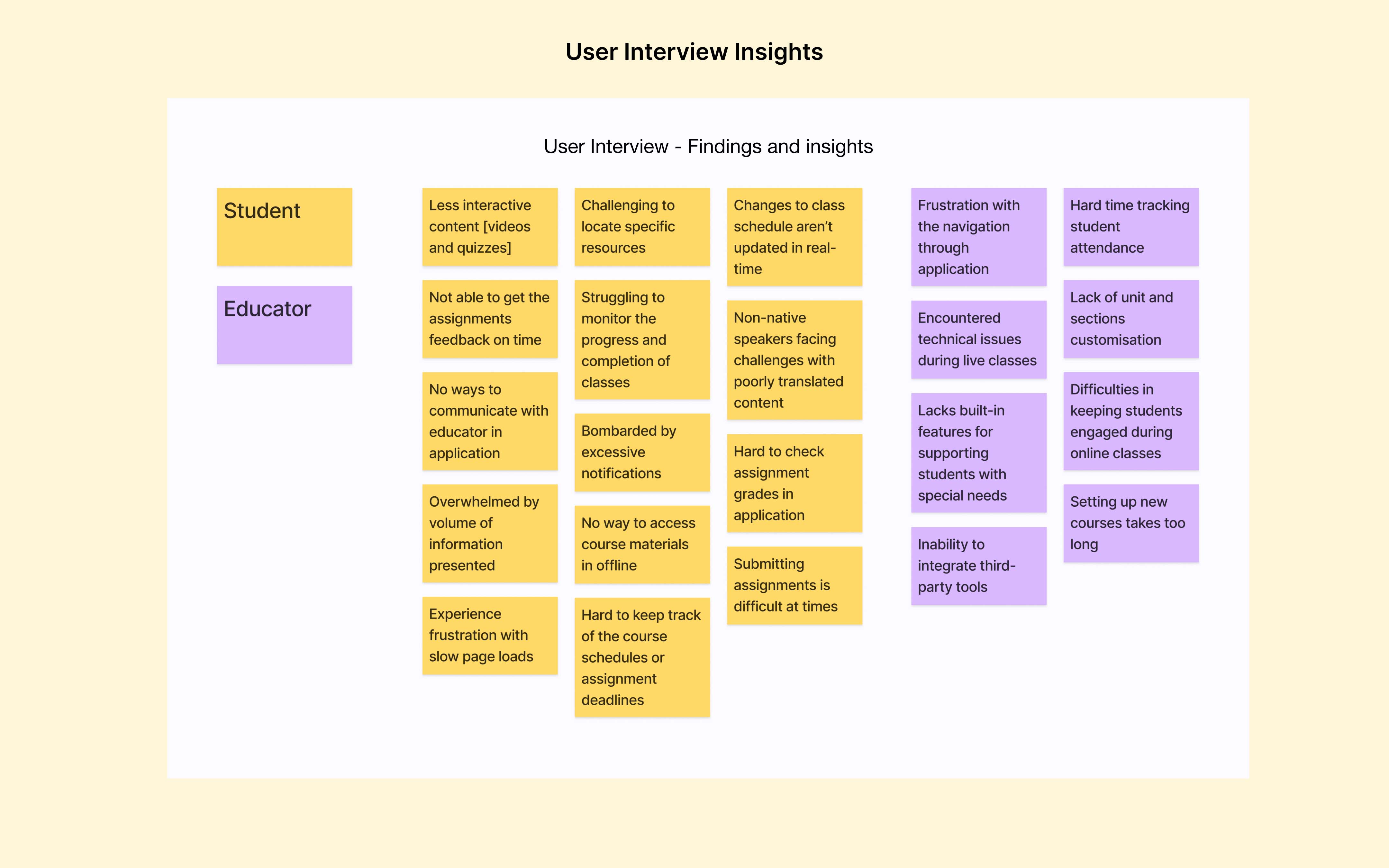
User Interview
The user interviews gave valuable insights into the challenges and expectations of students and teachers using the eCrayon platform.
Participant Profile
- 5 participants
- Ages: 16 to 23
- Profile: University and high school students
- Methodology: Semi-structured interview format
Interview Findings
- Users need customizable dashboards to prioritize key resources
- Lack of screen readers and accessibility support is frustrating for users at times
- The design feels outdate and not intuitive
- Teachers struggling to track student performance and class progress
- Teachers wish for platform integrations with tools like PowerPoint and Zoom in their workflows
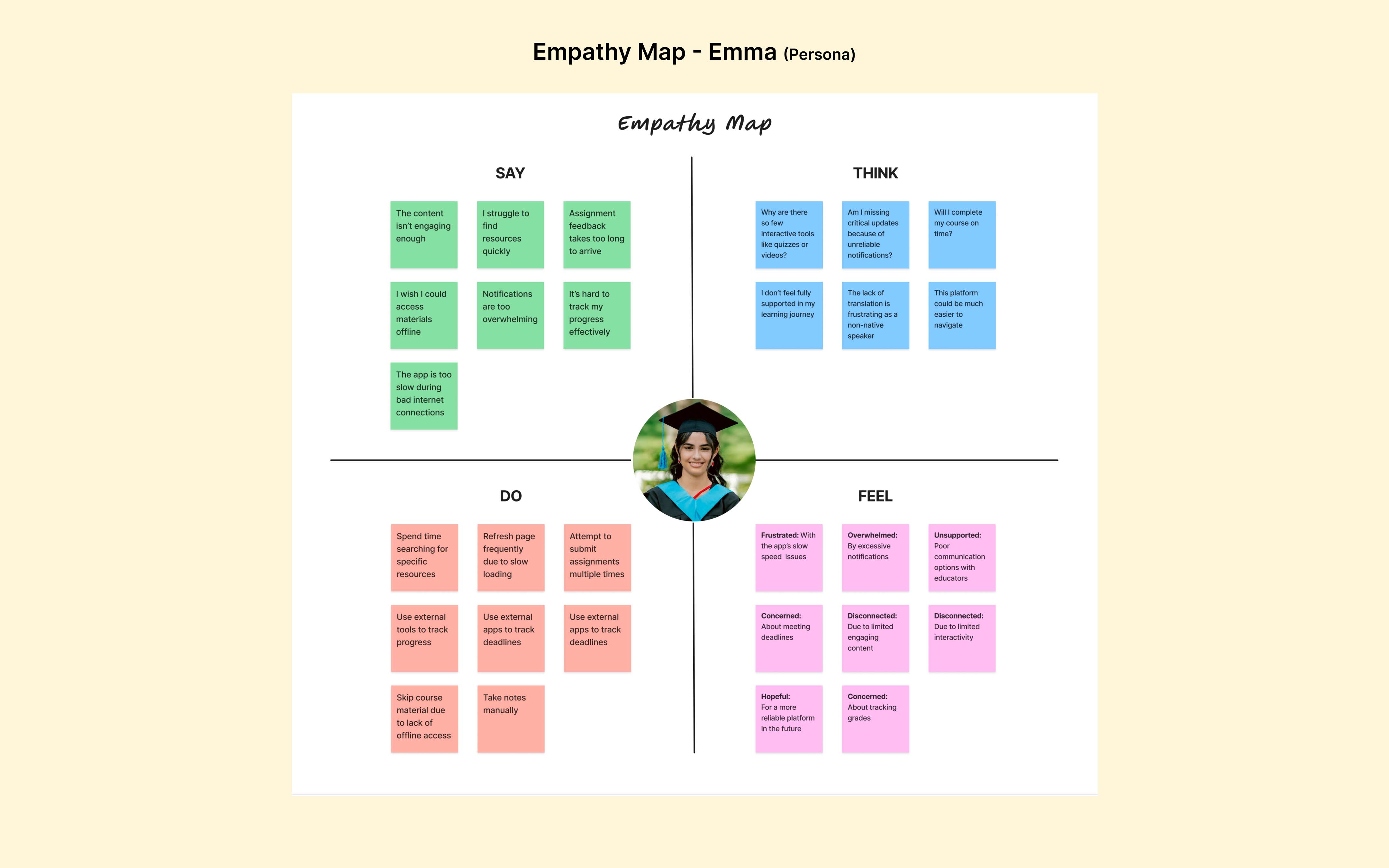
User Persona
The persona offered key insights into user motivations, behaviors, pain points and goals, fostering more empathetic user-centered designs. I created a persona Emma Johnson, a university student seeking a platform to simplify her academic journey and support her studies.

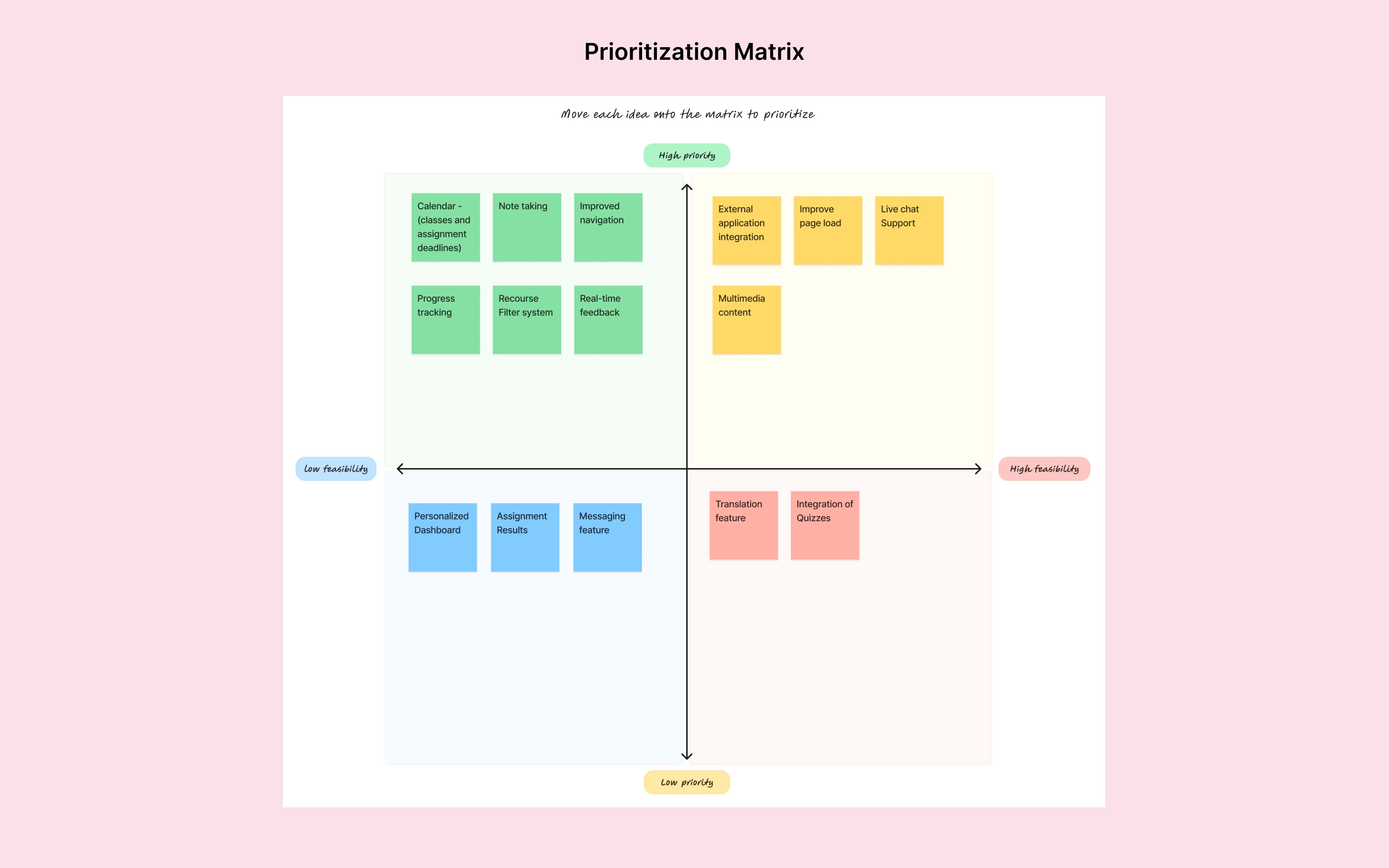
Define
Defining the Problem
I focused on defining possible solutions for the three key challenges identified earlier. The “How Might We” question framed as:
How might we enhance resource accessibility and improve communication between students and teachers?
These solutions align with the priority matrix, placing resource accessibility and communication as the top priorities to address immediate student needs and boost engagement.

Ideate
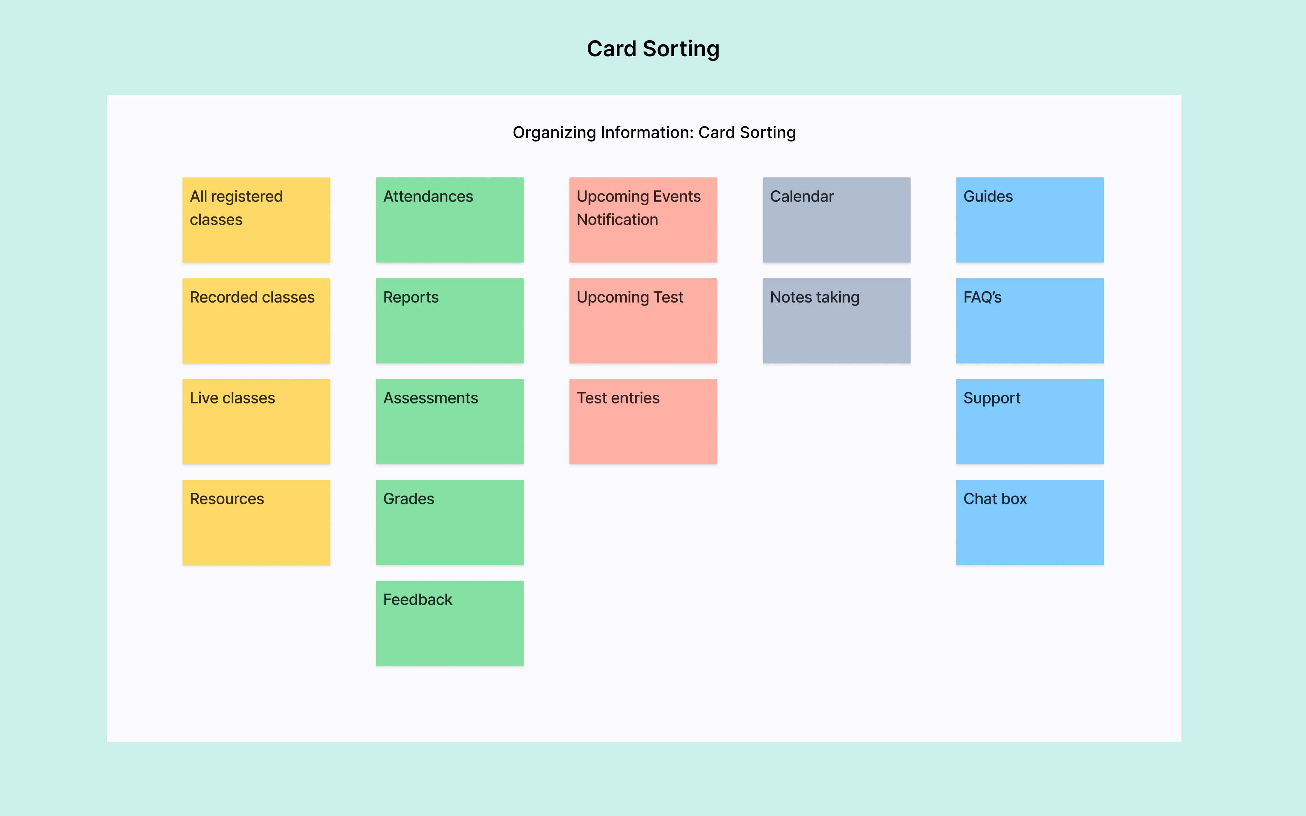
Information Architecture
Features and content were structured using card sorting to ensure intuitive navigation and a clear hierarchy. This process focused on grouping essential functionalities and improving accessibility, making the platform easy to navigate and user-friendly.
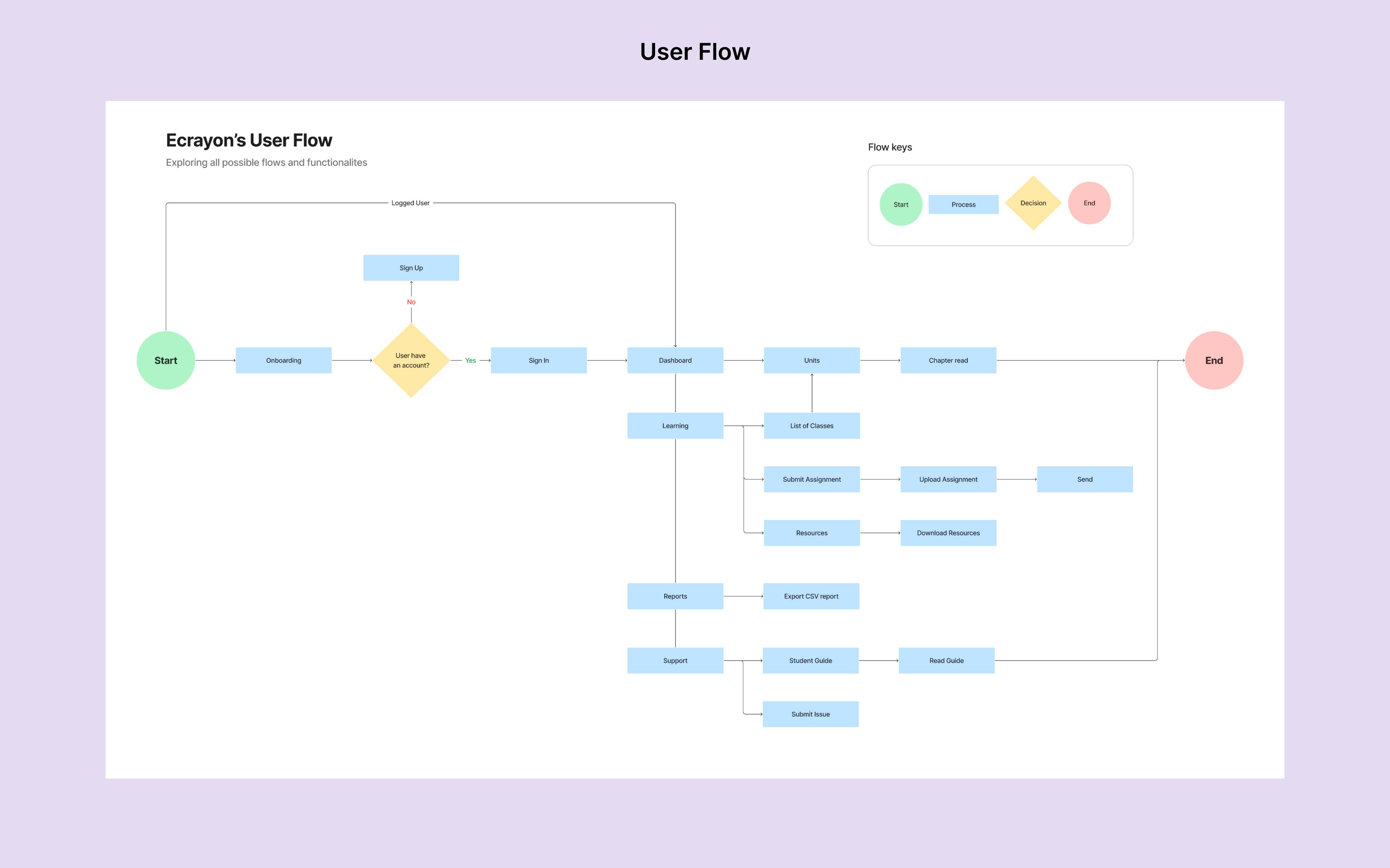
User Flow
Ecrayon’s user flows are rooted in UX and HCI principles, ensuring a seamless journey from login to feature access. After conducting rigorous testing with five participants, the flows were refined to address user key pain points.

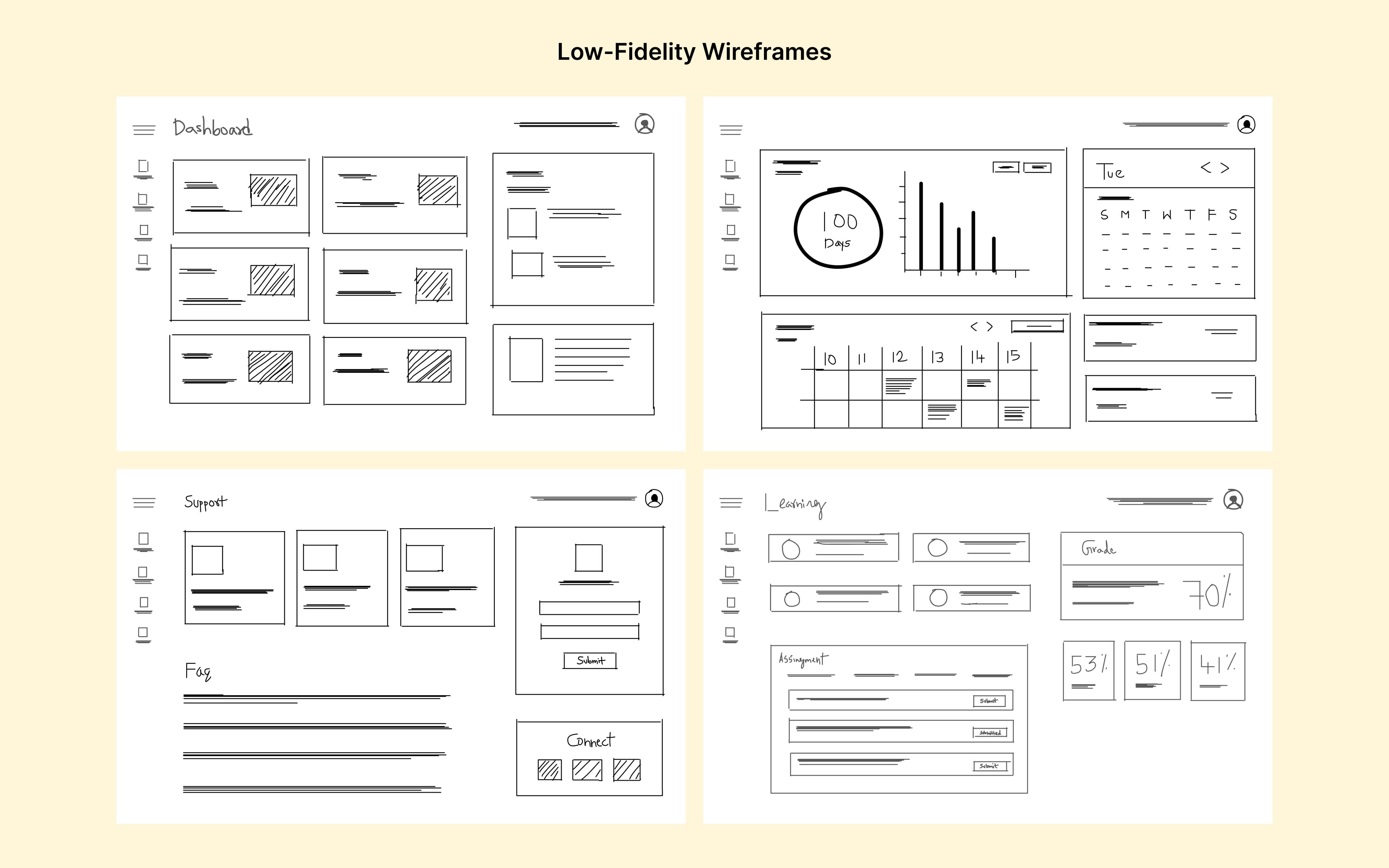
Low-Fidelity Wireframes
Using the Site Map and User Flow as a foundation, I developed low-fidelity wireframes to map out the layout and functionalities of the platform. This helped identify potential usability issues early in the design phase. I presented the prototypes to key stakeholders, gathering crucial feedback to refine the design further.
Prototype
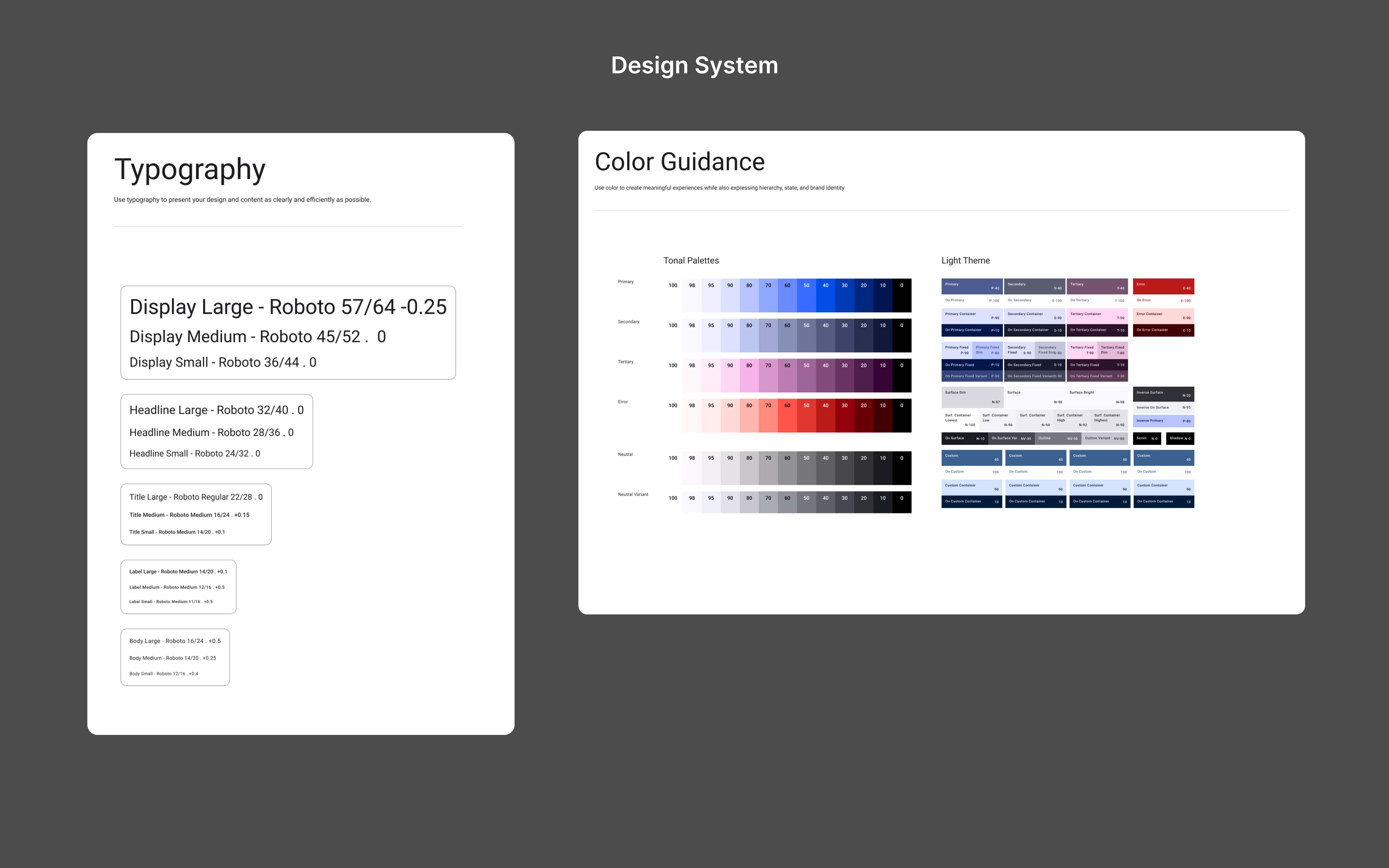
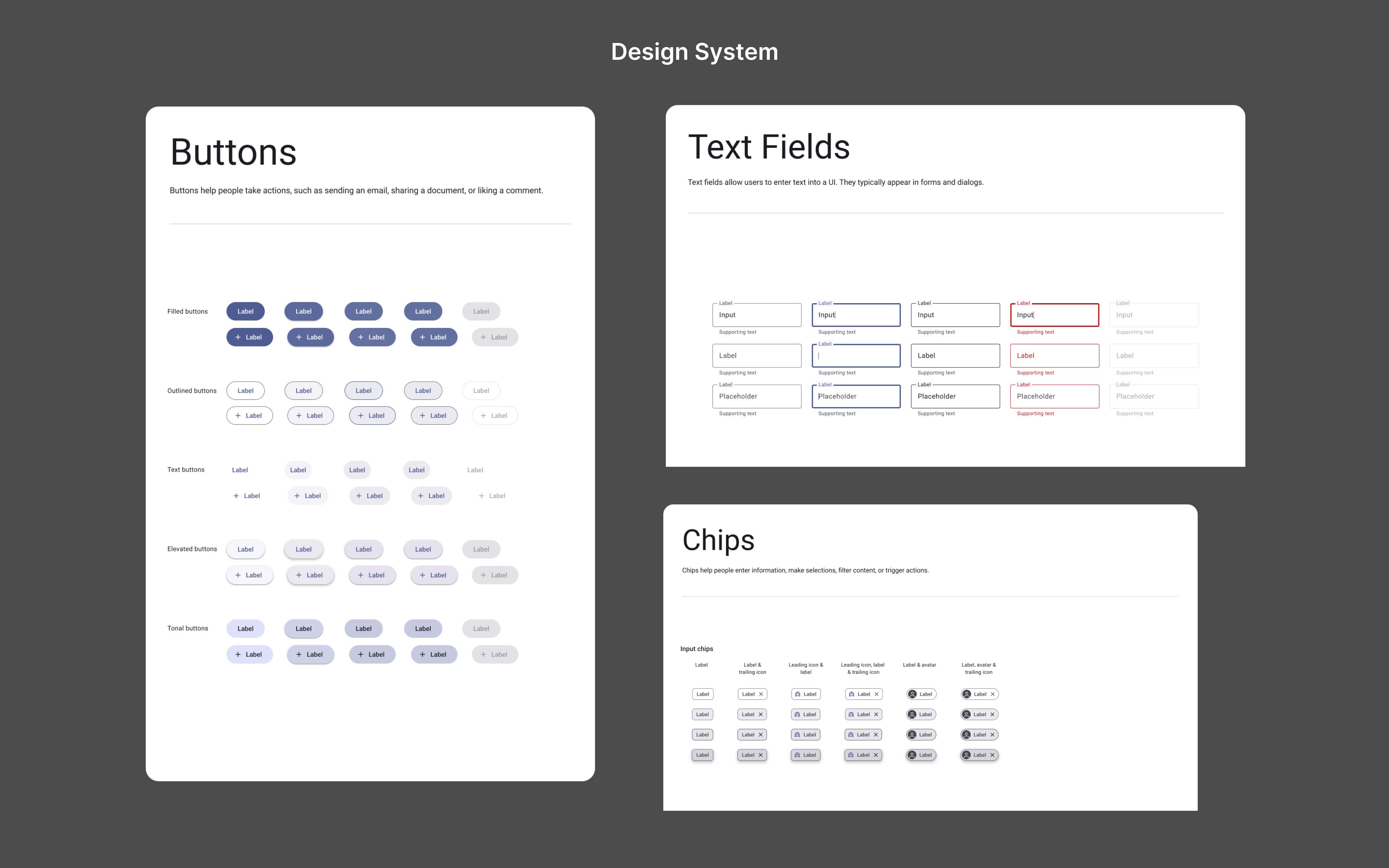
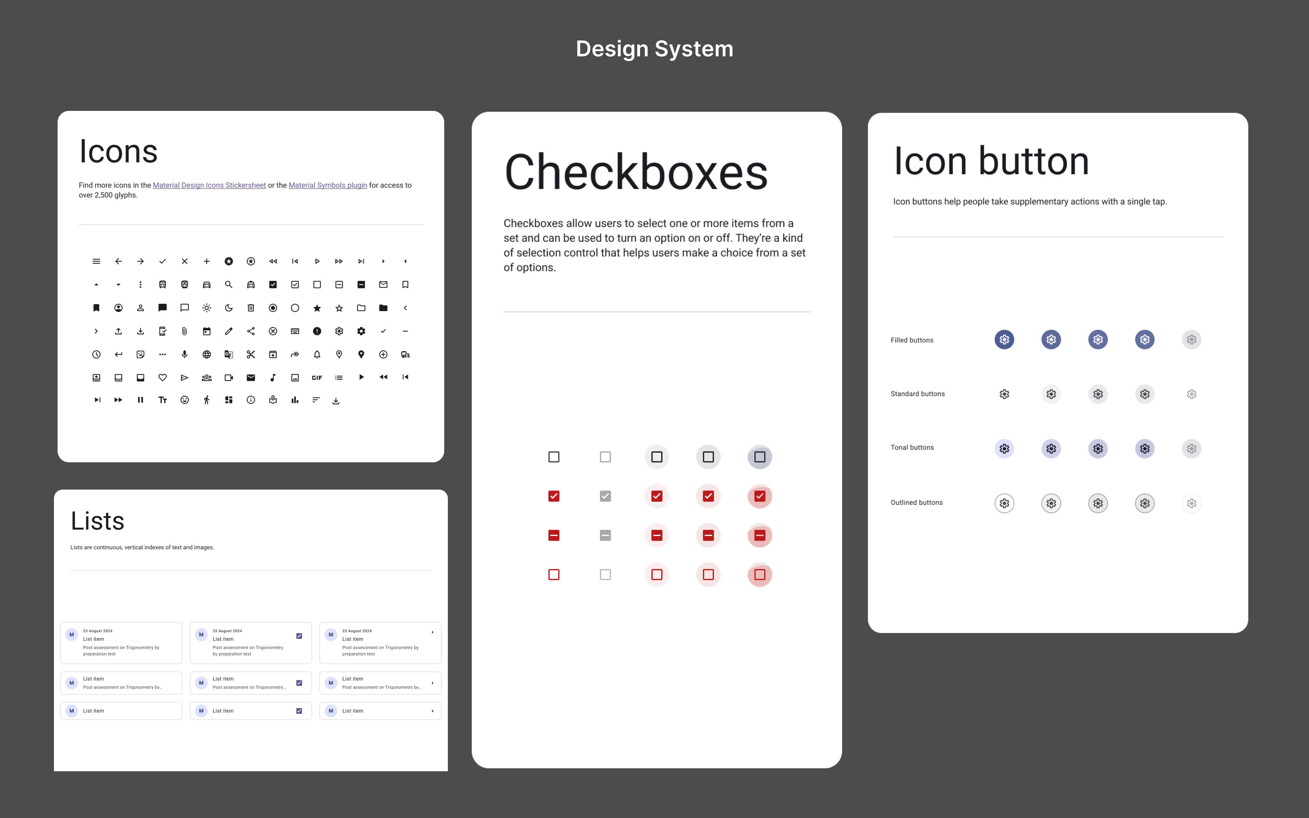
Design System
The design system was built using Material Design guidelines, ensuring consistency and a cohesive visual language across the platform. It incorporates Web Content Accessibility Guidelines (WCAG) 2.2 to prioritize inclusivity, enabling accessible interactions for users with diverse needs.
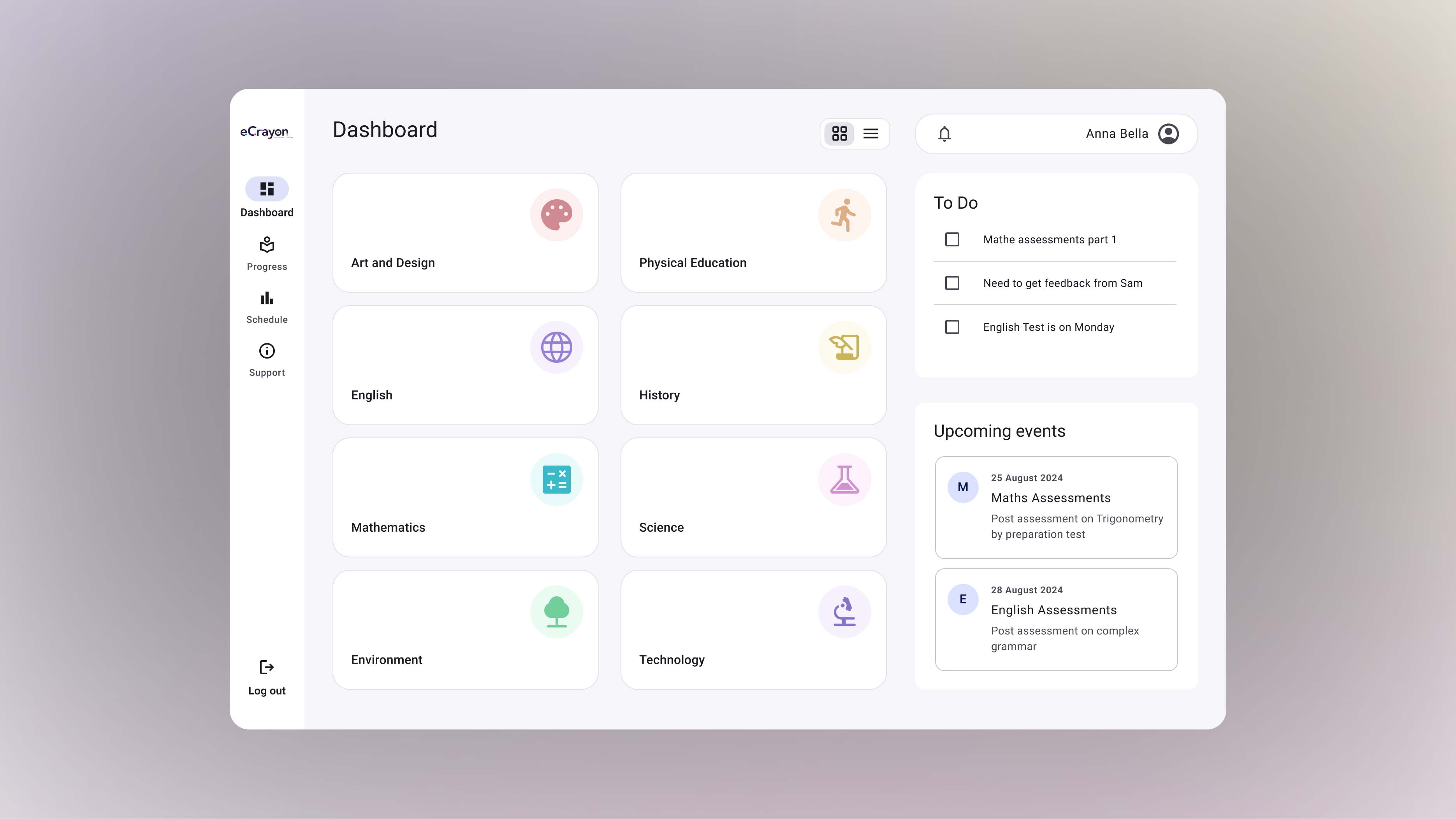
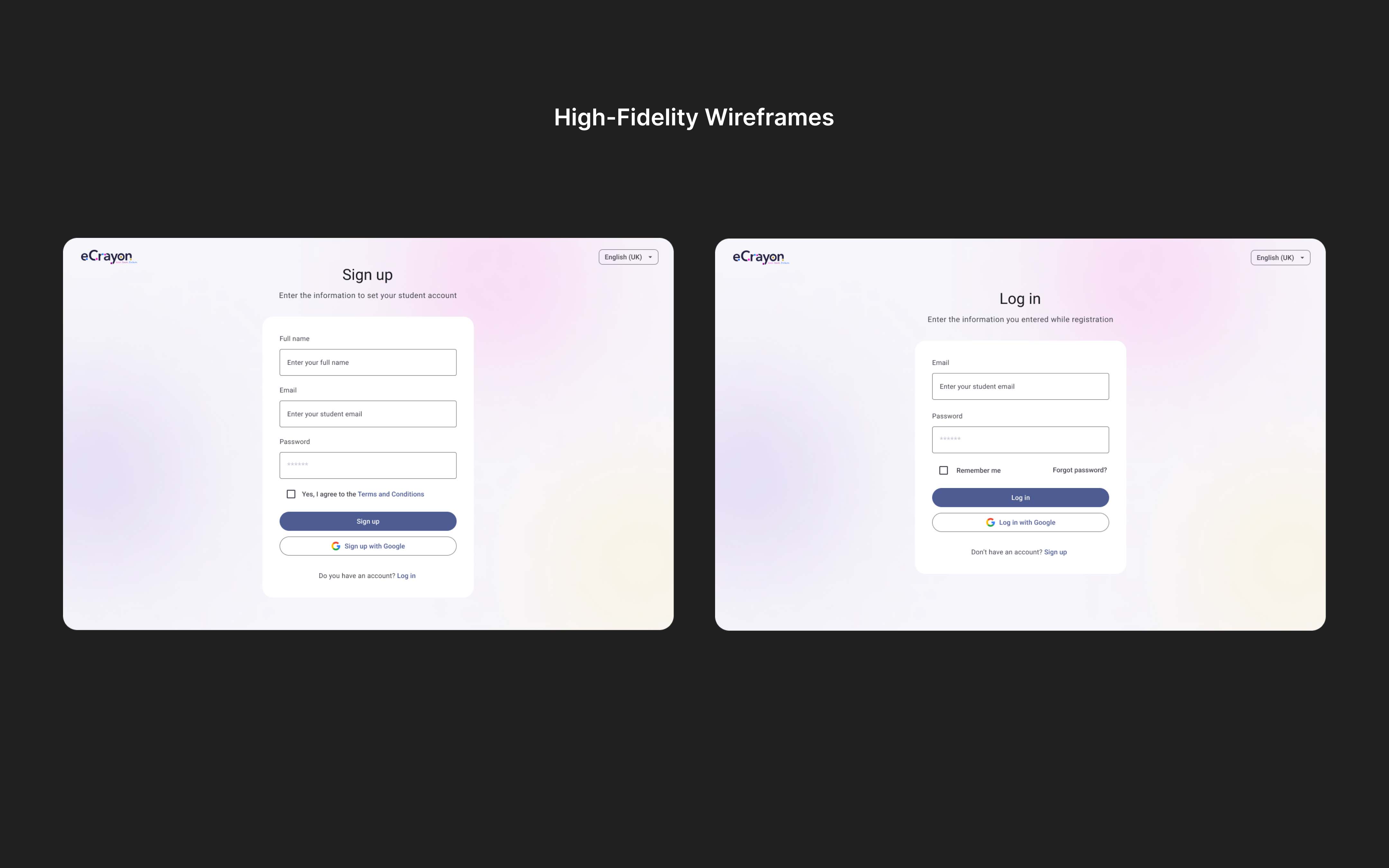
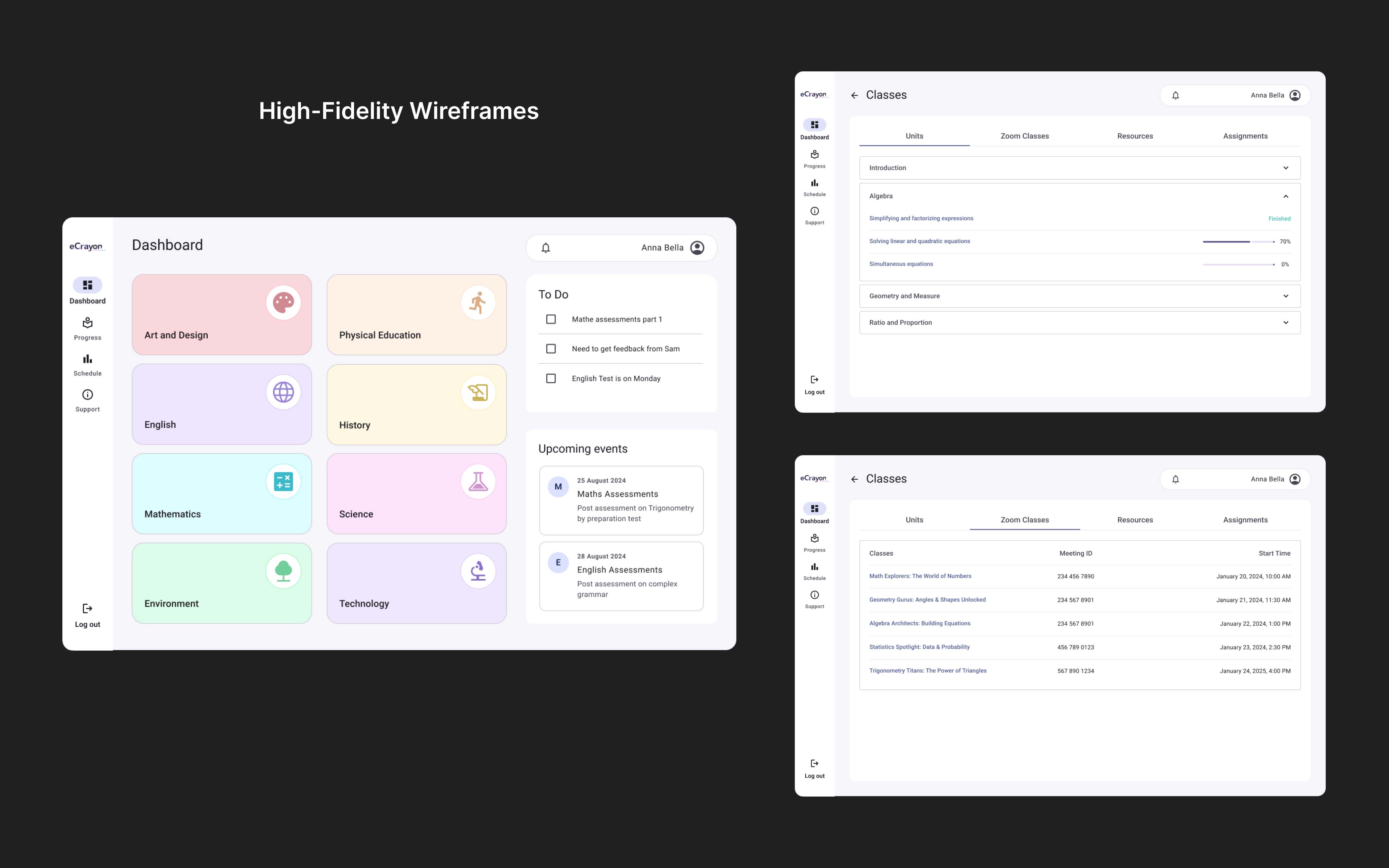
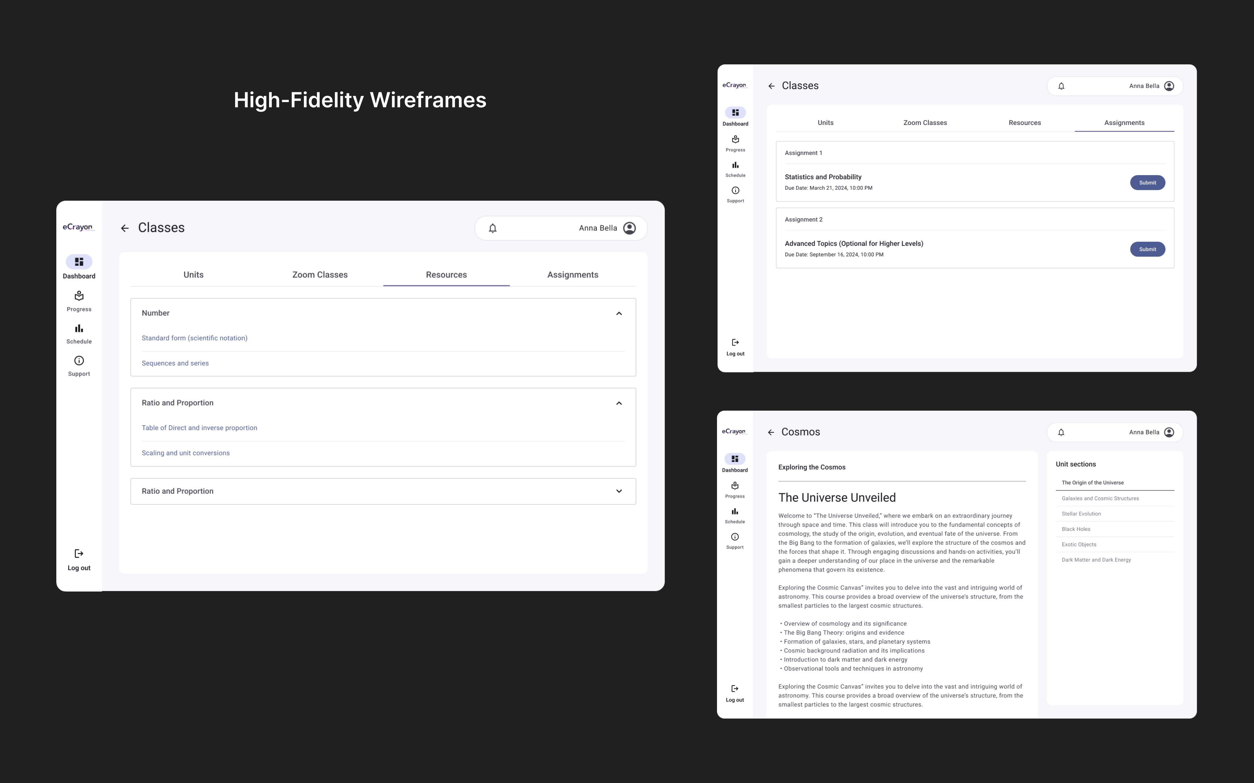
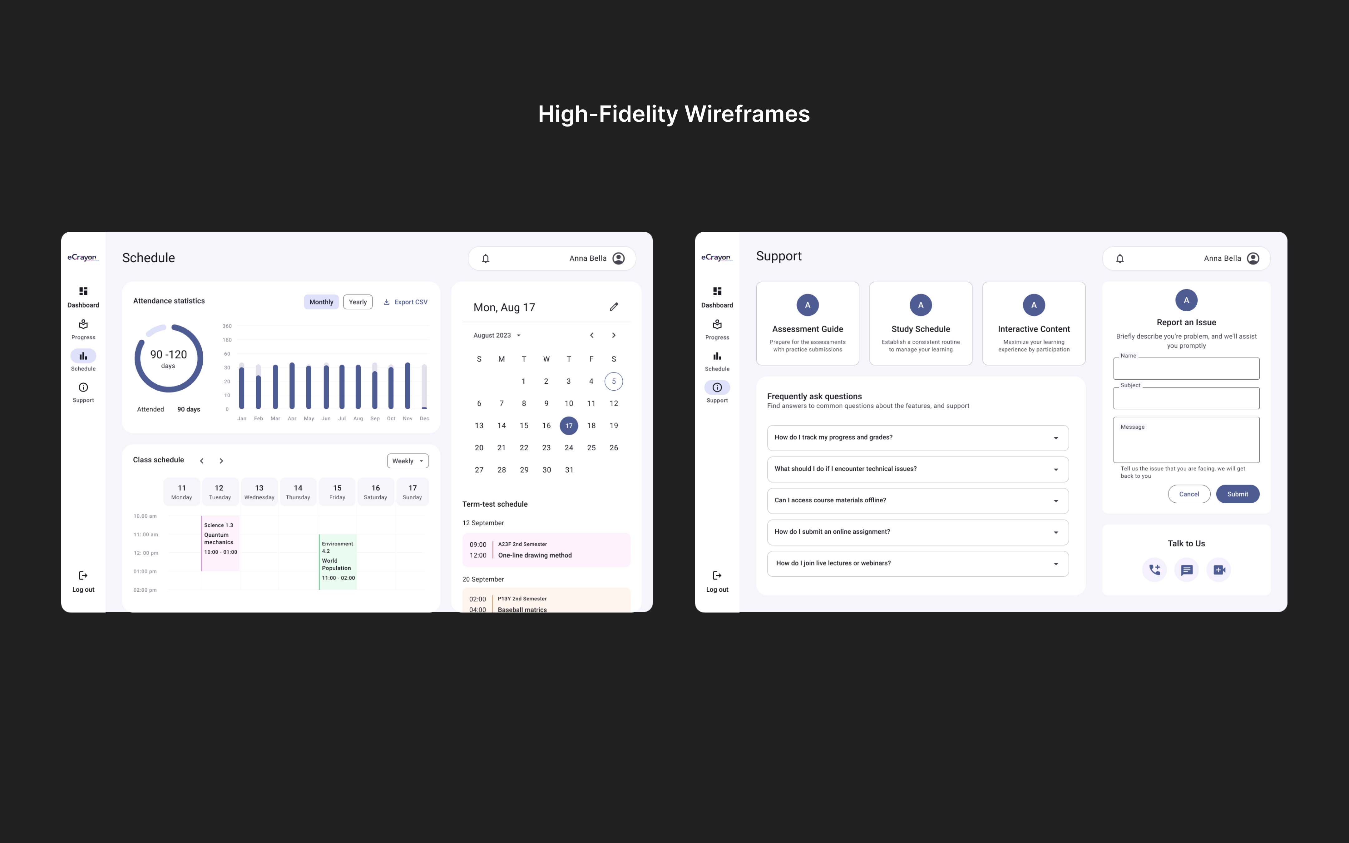
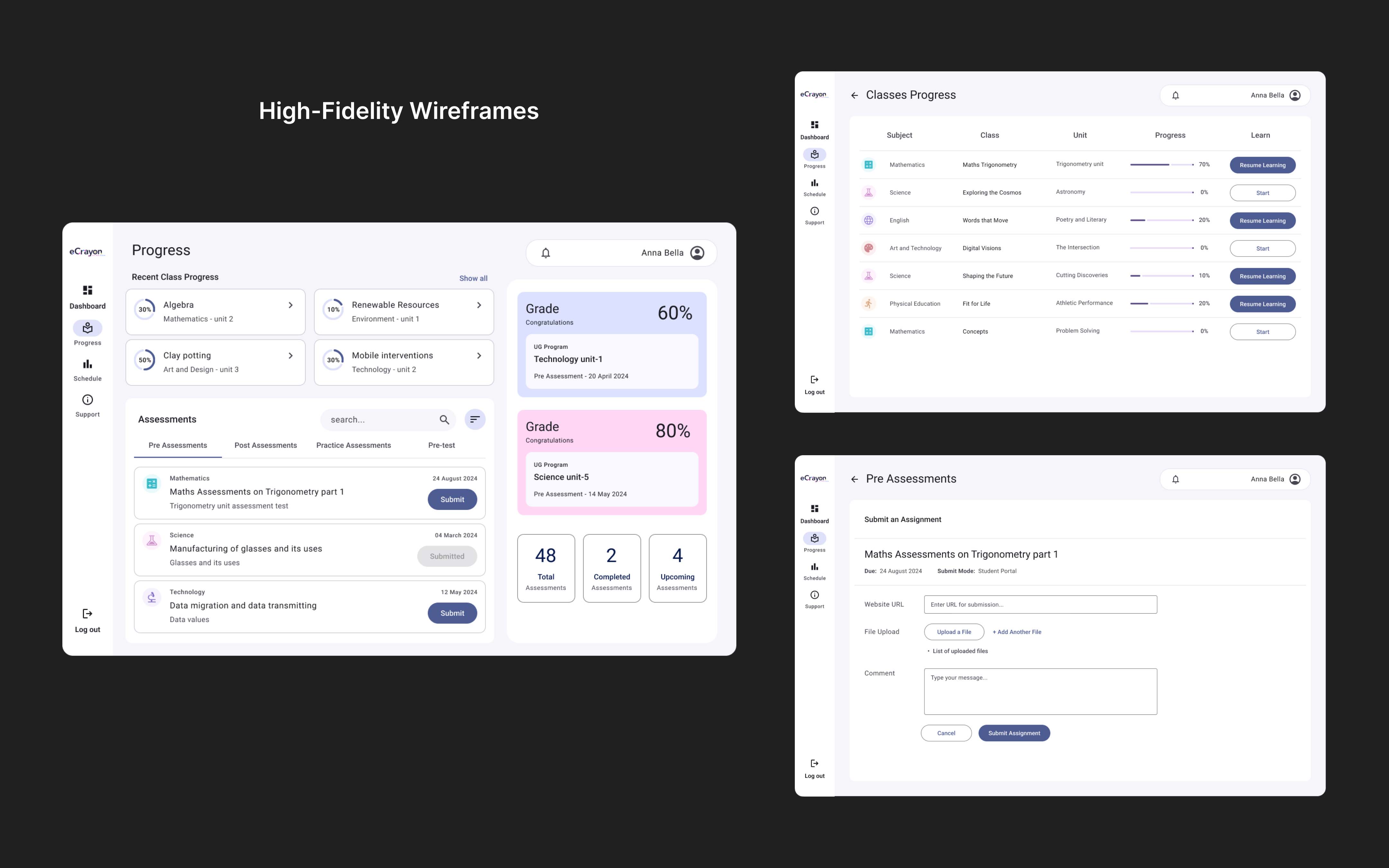
High-Fidelity Wireframes
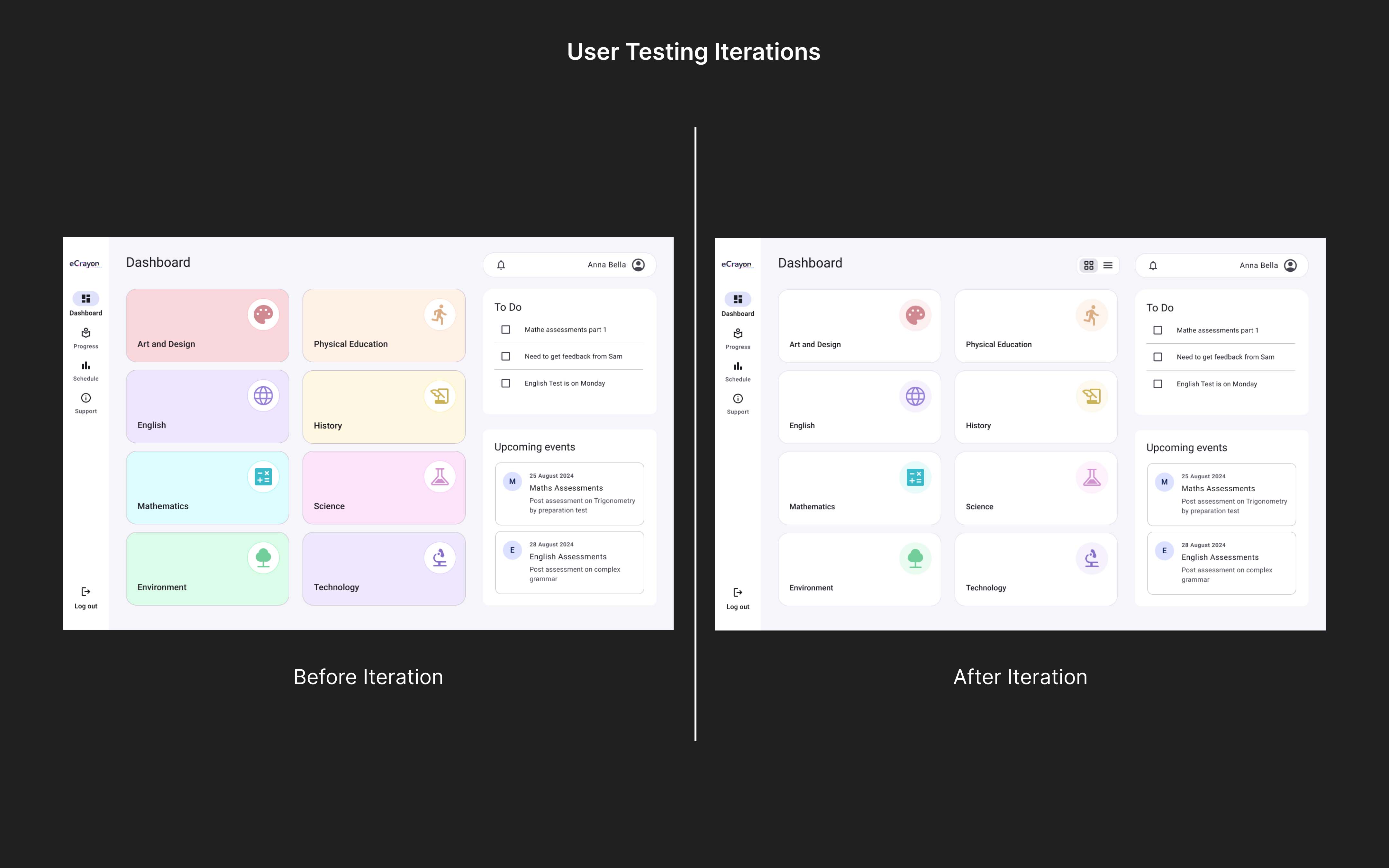
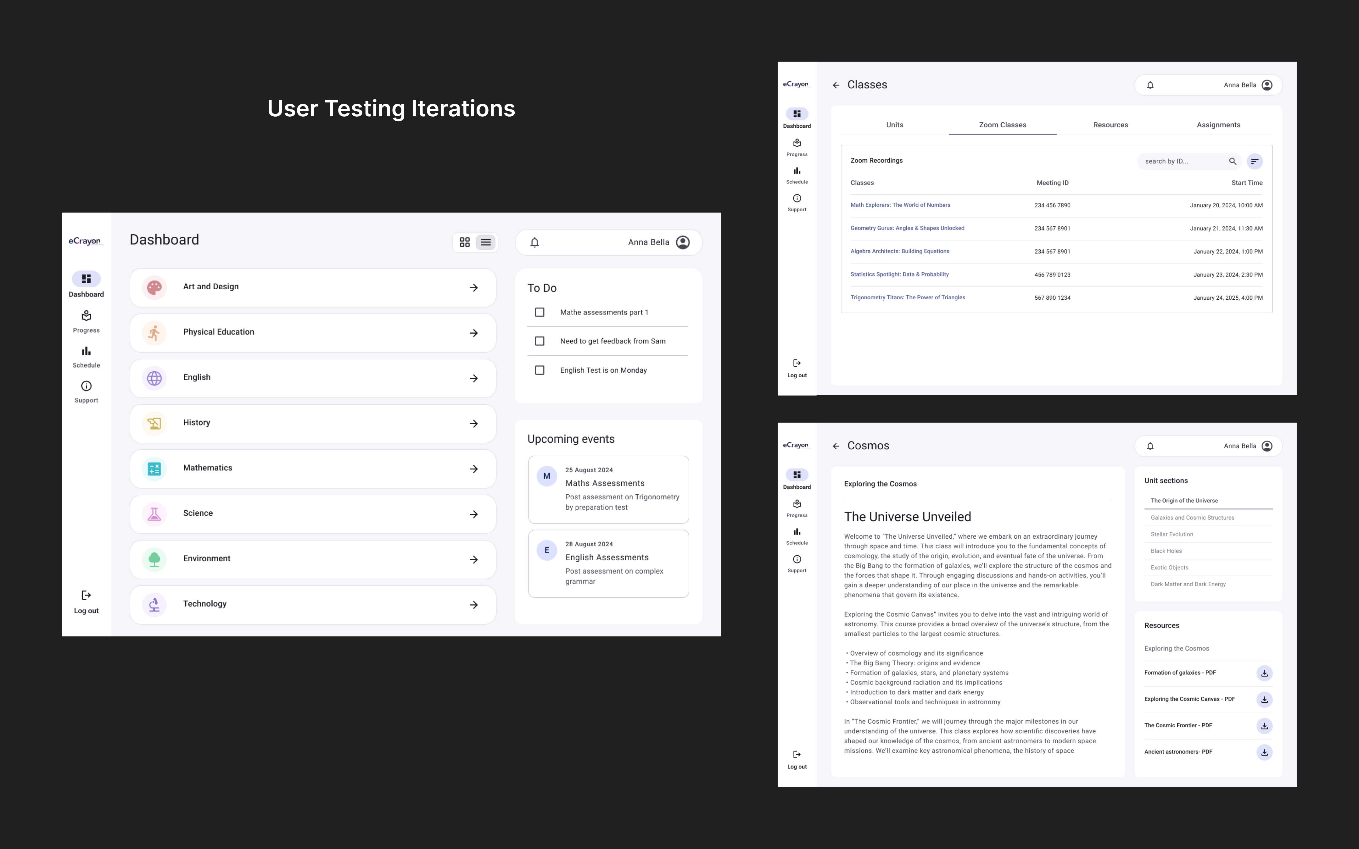
To deliver a personalized learning experience, I introduced a class progress tracker to help students monitor their self-learning journey. The UI was enhanced with modern, interactive elements, adhering to visual hierarchy and a cohesive color scheme.
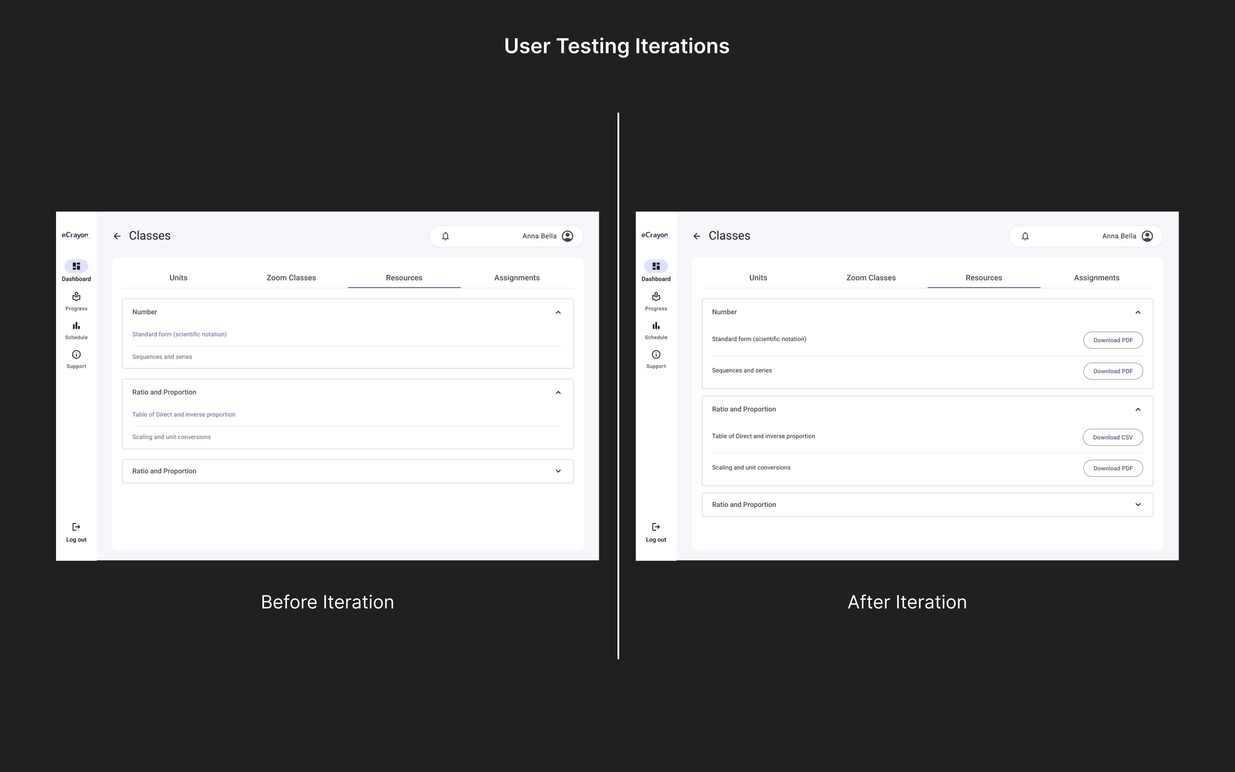
Content organization was simplified by redesigning class screens and improving access to resources and assignments. Third-party tools like Zoom were integrated to enhance engagement and support seamless video content delivery.
Test
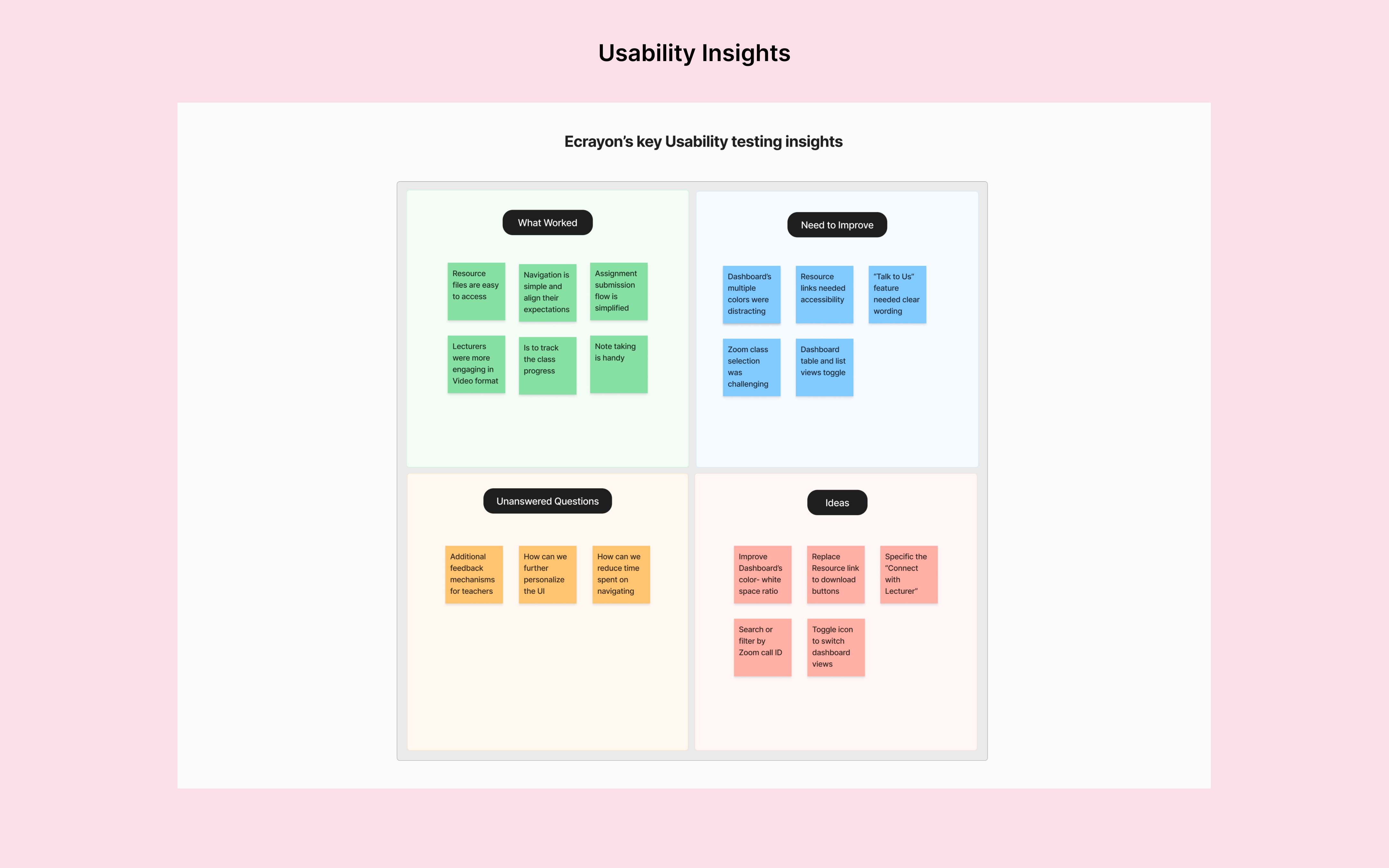
Usability Testing
The prototype was tested with 5 participants through one-on-one interviews to gain insights, focusing on user experience and interaction flow.
Wins
- Users appreciated the ‘resources’ tab for easy file access
- Assignment submission flow was simplified, increasing success
- Grades and results were easy to access
Opportunites
- Participants find dashboard’s multiple colors were distracting
- Resource links needed clearer navigation; replaced with a download button
- “Talk to Us” feature needed clearer design and prominence
- Zoom class selection was challenging; filters needed for easier navigation
The Outcome
These improvements created a more intuitive learning environment empowering students to stay engaged track progress seamlessly and access materials effortlessly. The client expressed high satisfaction highlighting the product’s enhanced usability and its positive impact on student learning experiences. The redesign resulted in:
- 30% increase in user engagement
- 25% reduction in navigation errors
- Significantly improved resource access