Rave
Overview
Rave is a social movie-watching app that enables users to stream content from platforms like Netflix, Disney+, and more, while connecting with friends. The app allows users to connect, enjoy movies together, no matter the distance, and making streaming a shared experience.
My contribution
User research User experience Product design
The team
1 × product designer 1 x project manager 2 x developers 1 × co-founder
Year
2023
Challenge
The challenge was to recapture the magic of the movie-watching experience, focusing on seamless connection and ease of use. The main goals were to:
- Create a stable and scalable platform that could support a growing user base.
- Enhance the overall movie-watching experience, focusing on ease of use and enjoyment.
About Rave
Since its launch in 2019, Rave quickly evolved from a simple platform for friends watching movies together online to the go-to movie hangout app, amassing over 10 million downloads by 2024 on the Google Play Store.
Solution
The solution focused on redesigning the app for intuitive usability, and enhancing the watching experience. Through user interviews and usability testing, I gathered insights on behaviours, preferences, and pain points. This feedback guided identified trends, and pinpointed improvement opportunities.
Empathy
Competitive Analysis
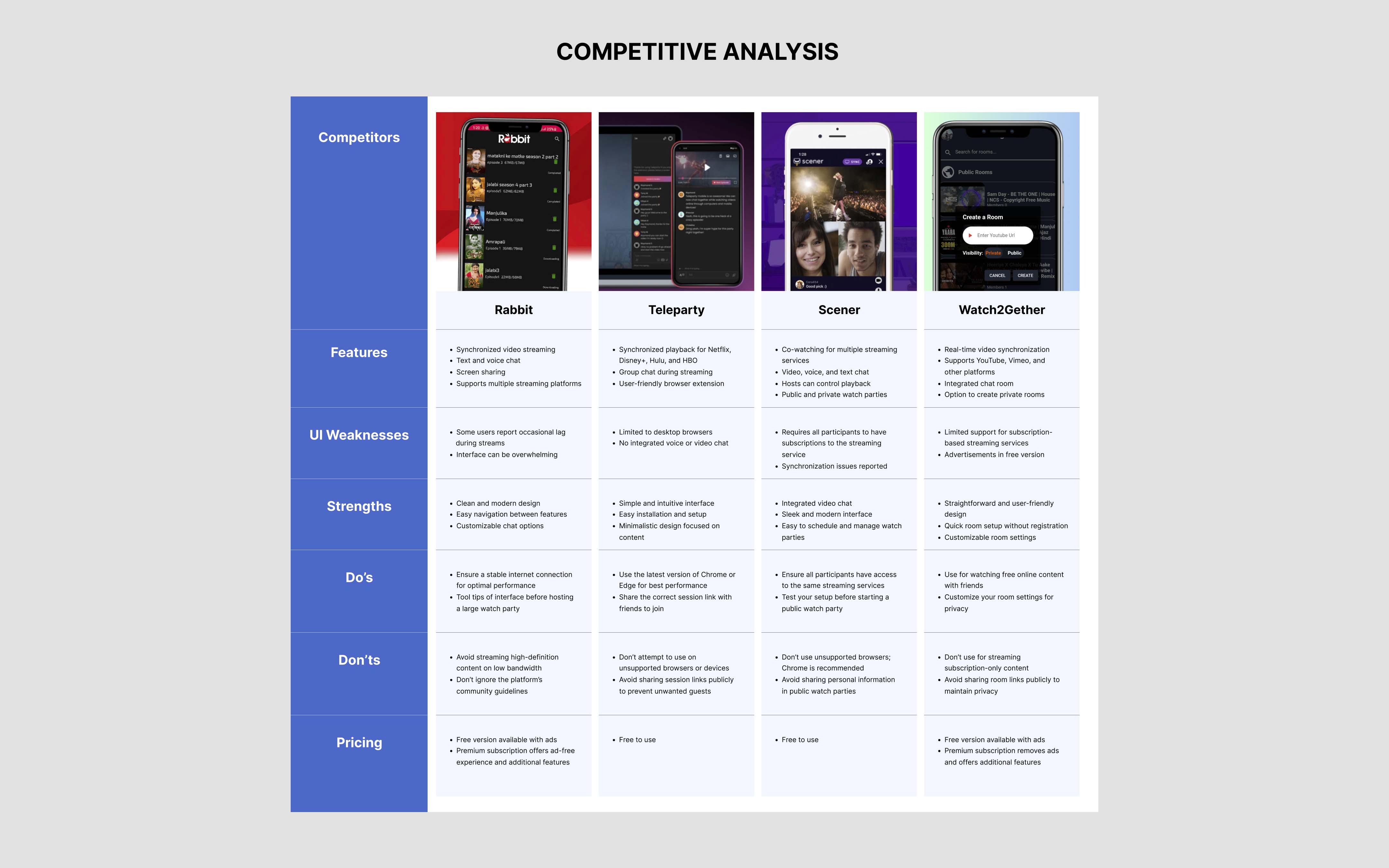
I analyzed key social streaming apps to evaluate their strengths and weaknesses. This helped identify opportunities to improve Rave’s usability and differentiate it from competitors, ensuring design decisions align with market trends and user needs.
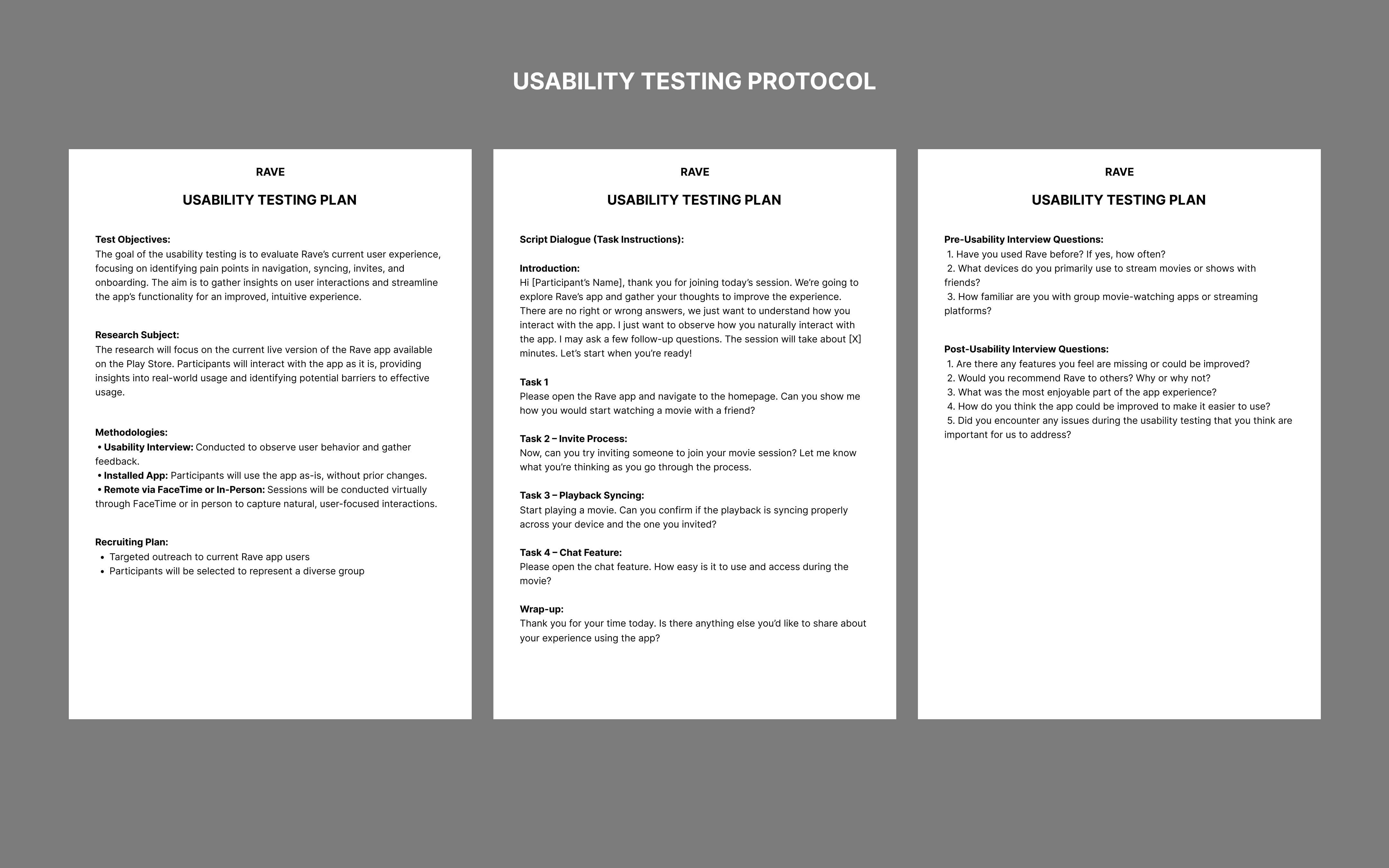
Usability Testing
To identify challenges in Rave’s current design, I conducted 1:1 usability testing with 6 participants, using pre-recorded questions to gather insights. The sessions focused on key functionalities like group movie watching, playback syncing, in-app chat feature, and cross-device compatibility.
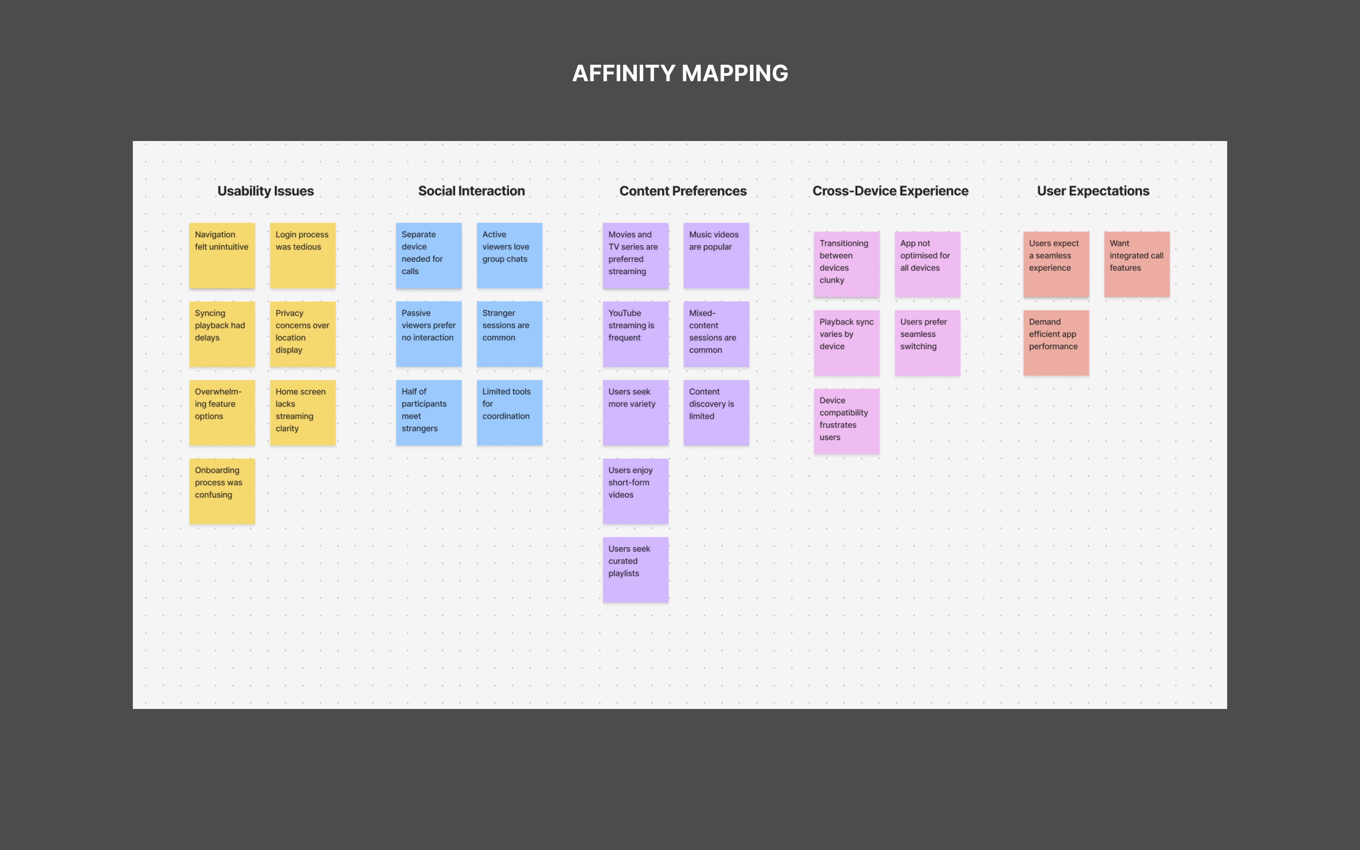
Key Findings
- Users found the interface cluttered, making navigation difficult.
- Playback syncing was inconsistent, frustrating users during group sessions.
- Participants had trouble with the invite process, causing incomplete groups.
- Certain features, like chat options, felt overwhelming and lacked clarity.
- Users faced challenges transitioning smoothly between devices.
- The onboarding process lacked clarity, leaving users confused.
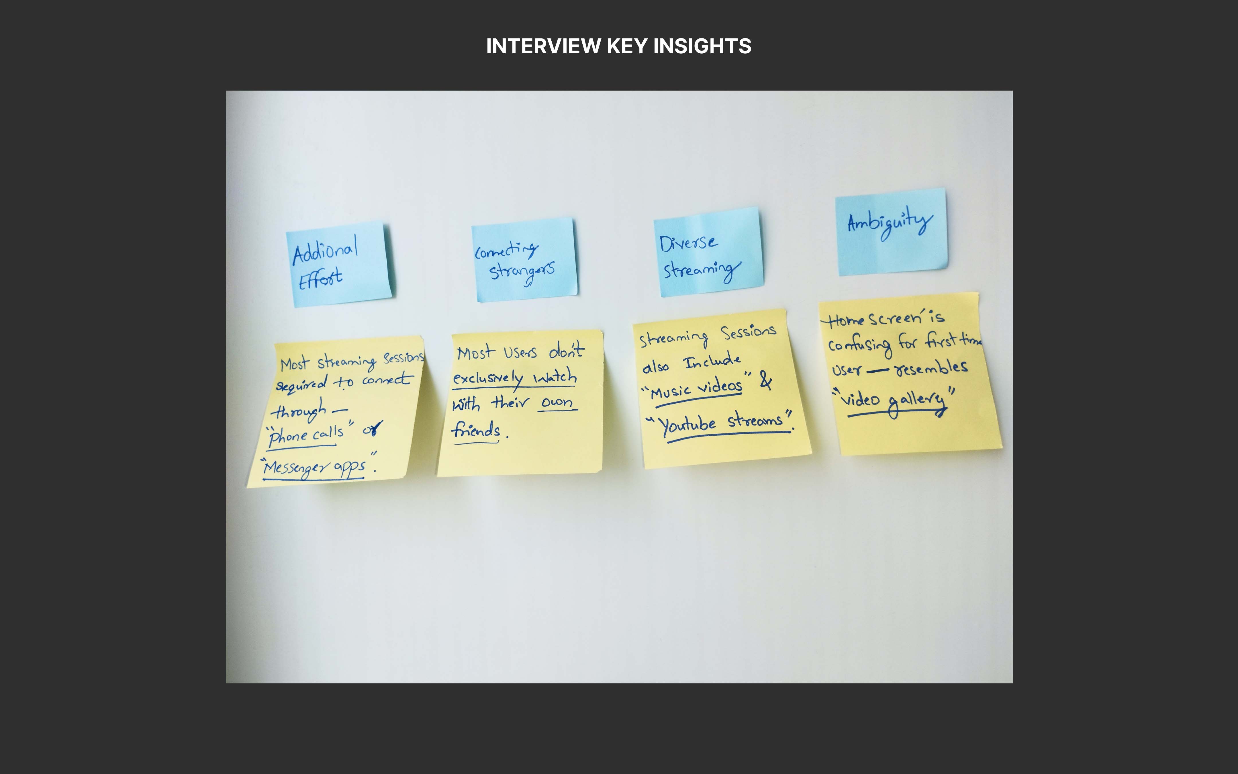
User Interviews
Initially, the user interview results were surprising. However, as I reviewed the data, it became clear that Rave had become essential to users’ routines. Their increased reliance on the app meant they now expected a smoother, more intuitive experience that seamlessly fit into their social interactions.
Participant Profile
- 8 participants from diverse demographics
- Ages: 16 to 38
- All users with 1+ year of app experience
- Conducted via in-person and FaceTime with a semi-structured format
Interview Findings
- Users expressed frustration with using a separate device for calls, which disrupted their experience.
- Users had difficulty logging into Netflix, Disney+, etc., creating friction before starting the every session.
- Users either interacted through chats and comments (Active Viewers) or watched without interacting (Passive Viewers).
- Many users watched with new people, not just friends. Half of session participants were strangers.
- Sessions often included music videos or YouTube, not just movies or TV shows.

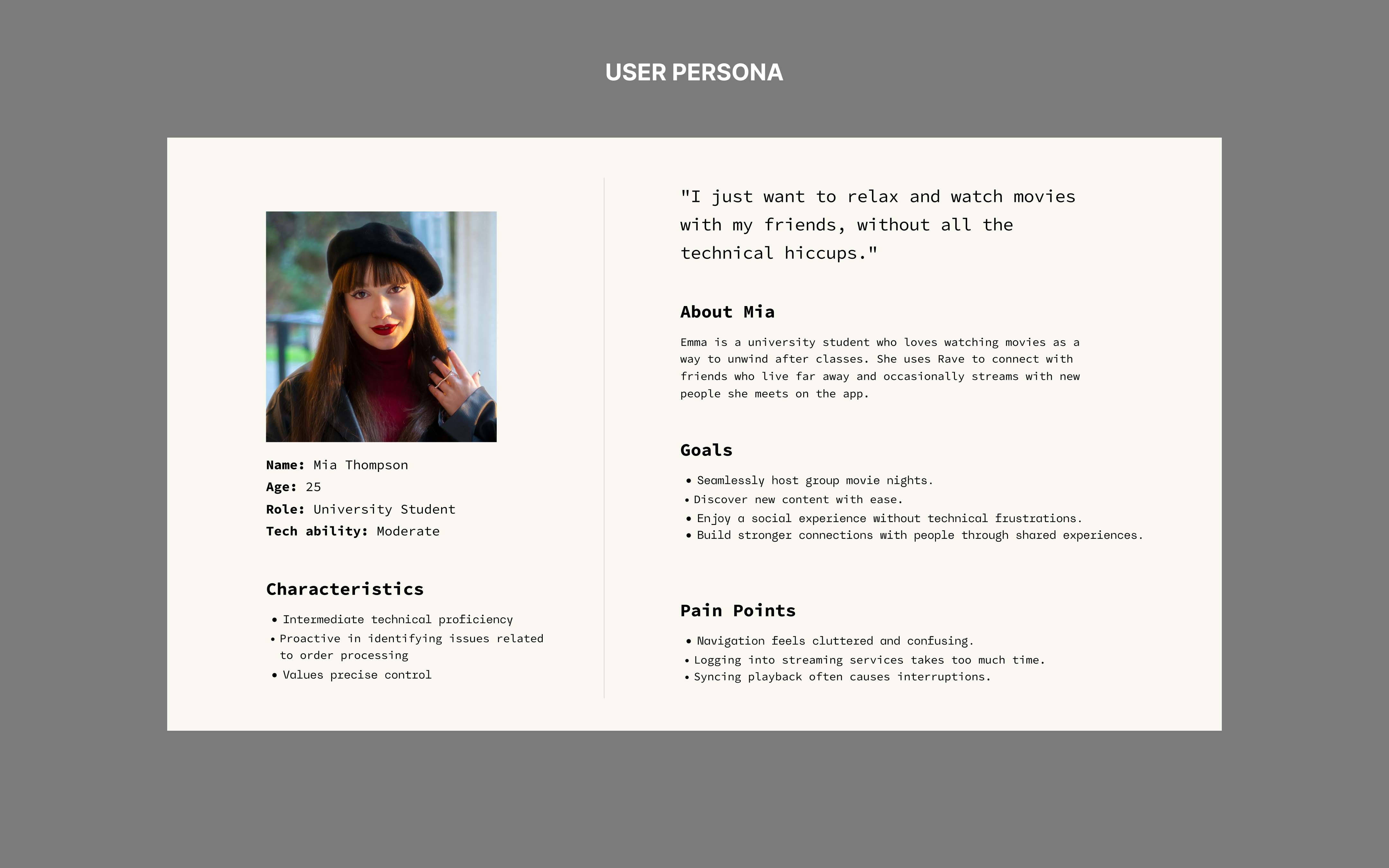
User Persona
To better understand Rave’s diverse user base, I created a persona that encapsulates the behaviours, motivations, and challenges identified during research. This persona helps align design decisions with user needs while ensuring the app delivers a seamless experience.
Define
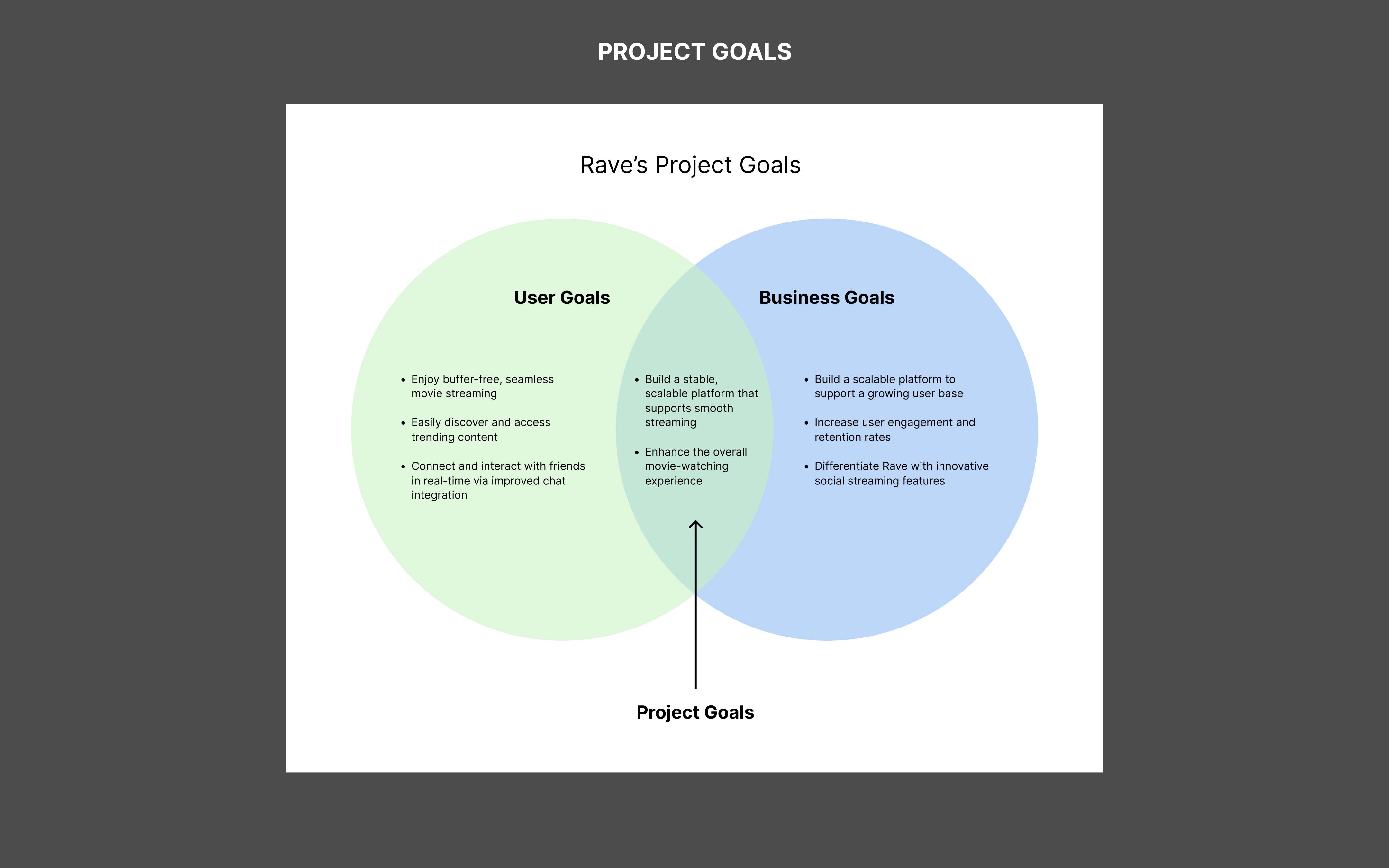
Project Goal
The Venn diagram of project goals clarified shared objectives, ensuring alignment. It emphasized the need for a stable, scalable platform and an enhanced movie-watching experience with both users and Rave prioritizing great app features.
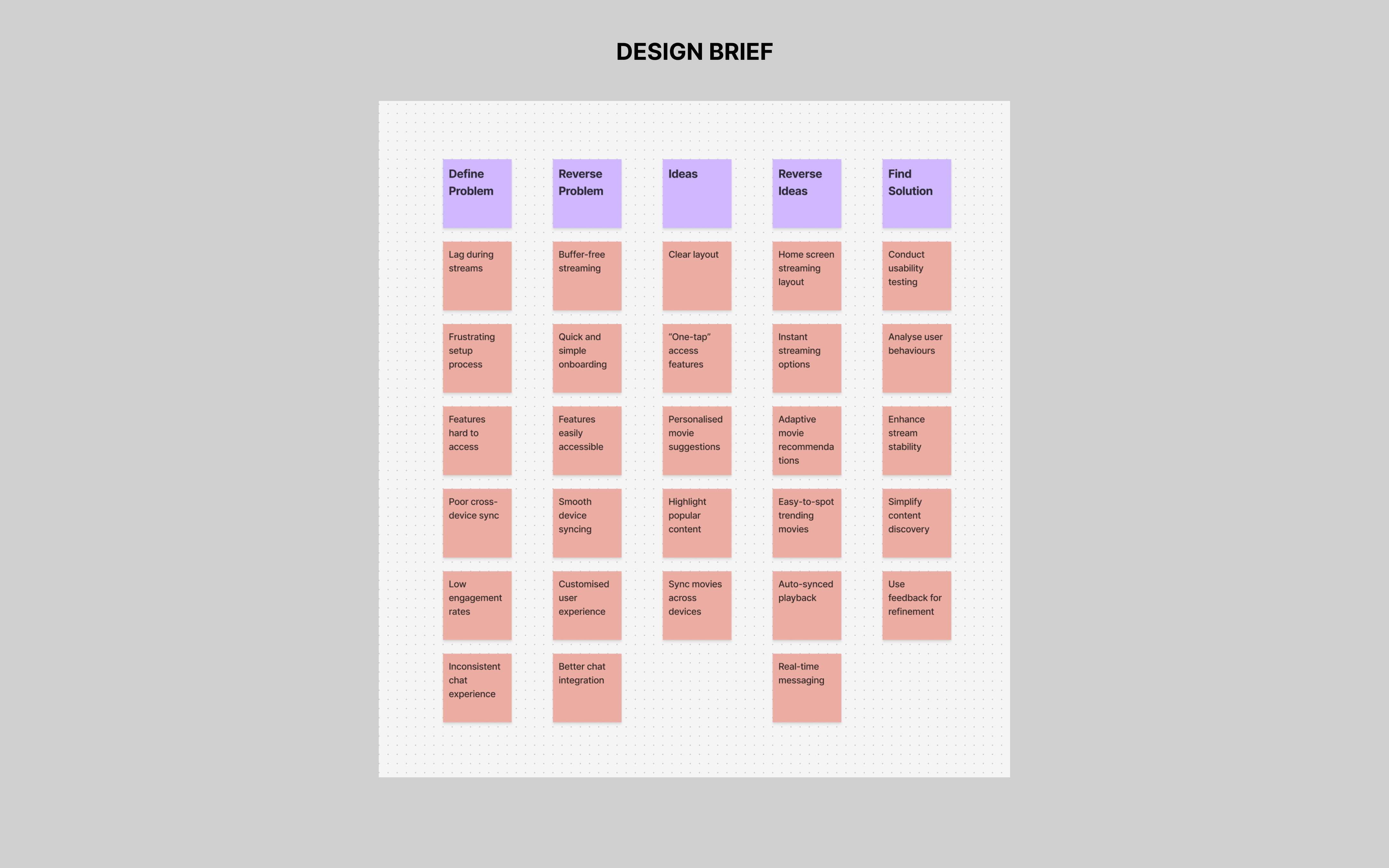
Defining the Problem
Through in-depth analysis of the research insights, I identified key user needs, which led to a clear problem statement and the guiding question:
How can we create a more seamless viewing experience for users?
To answer this, I concentrated on three core questions that would shape the solution:
- How can the design be inclusive for all users?
- What contextual factors must be considered to enhance the experience?
- What elements contribute to the ideal movie-watching environment?
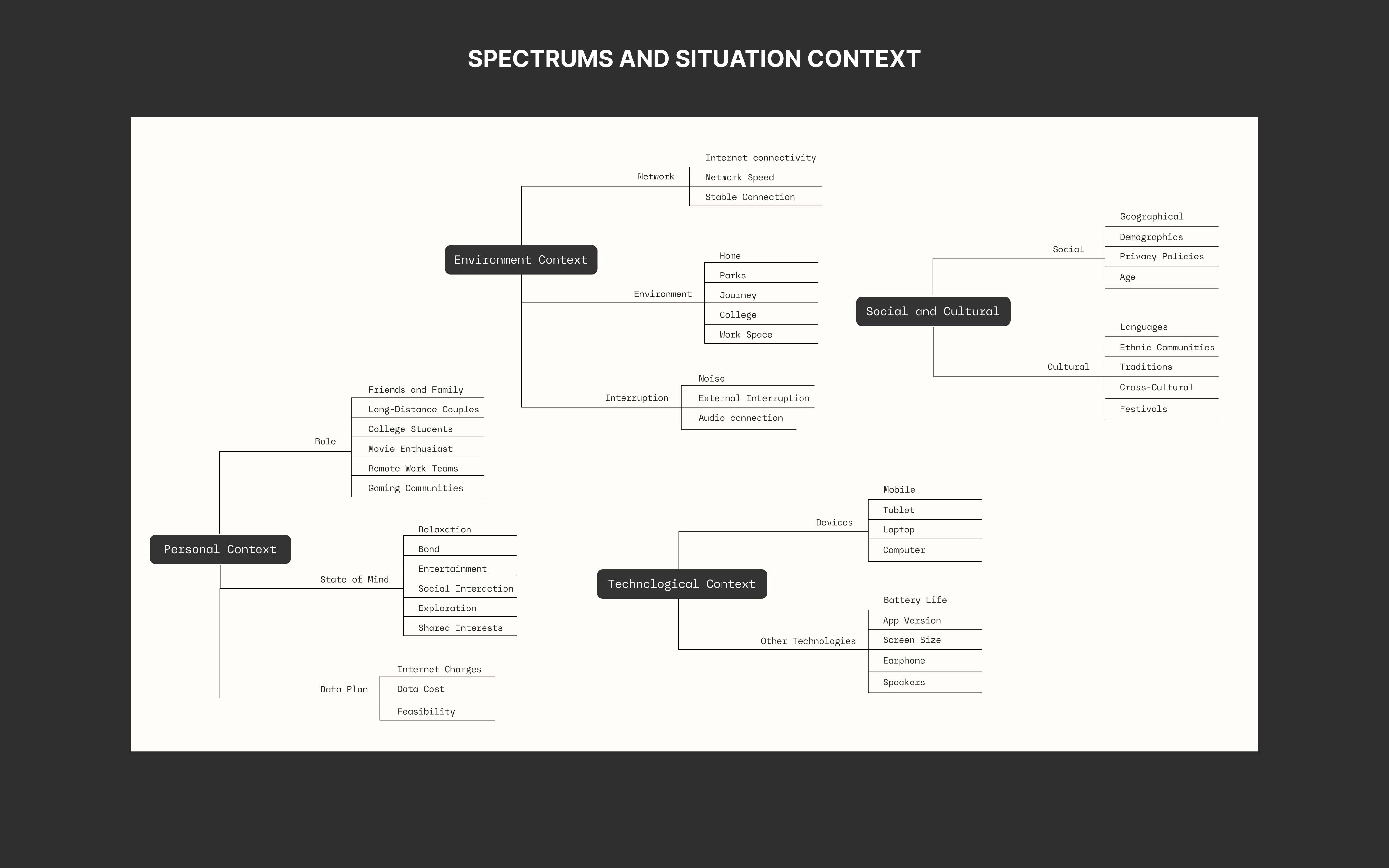
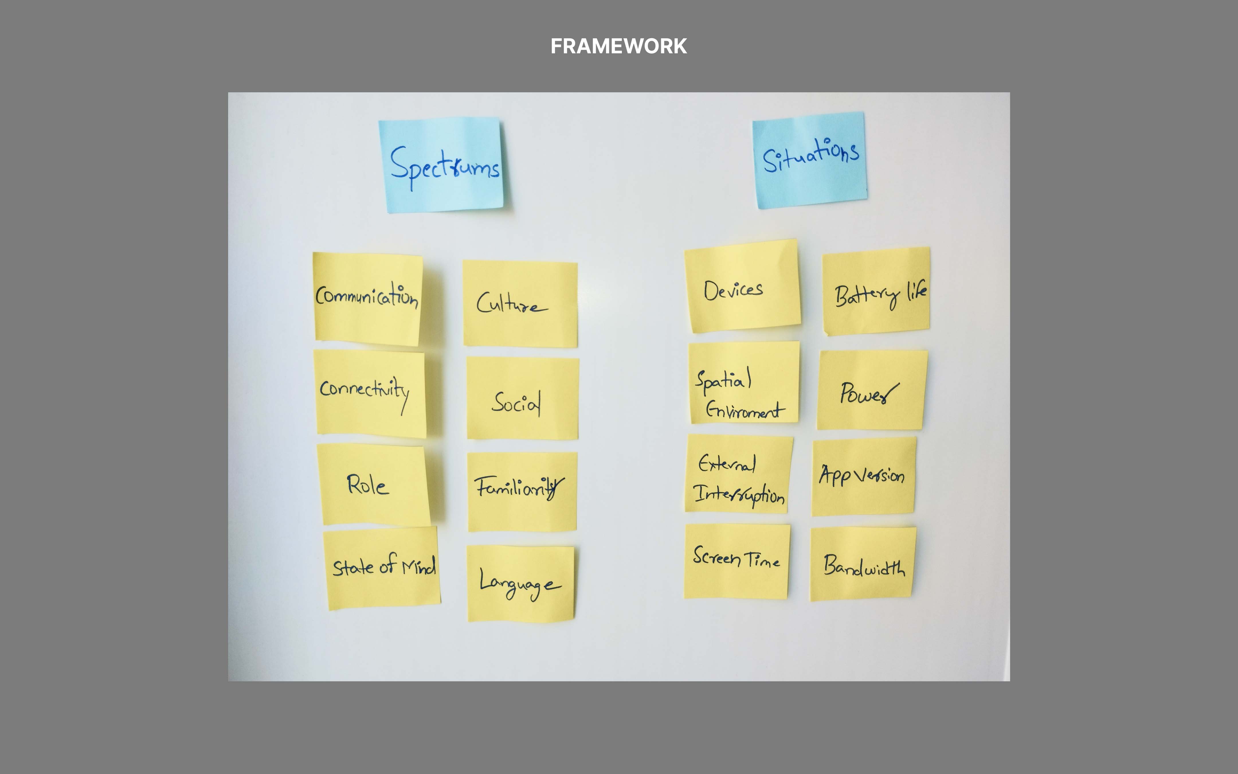
Framework
I mapped the user journey across concepts using the Spectrums and Situations frameworks. Spectrums highlighted user challenges, while Situations focused on temporary contexts affecting interactions. This approach helped challenge assumptions and ensure scalability from the start.

Ideate
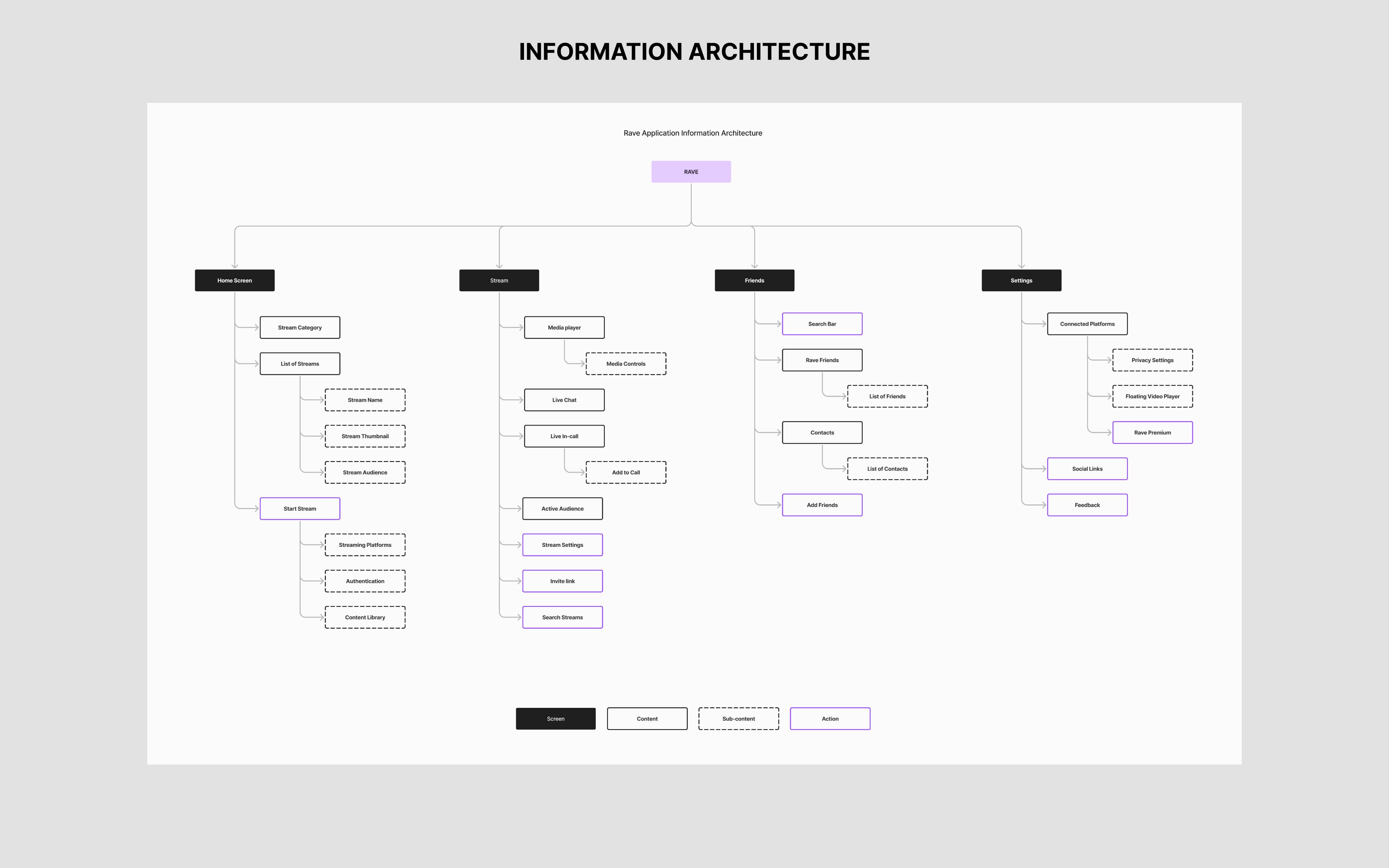
Information Architecture
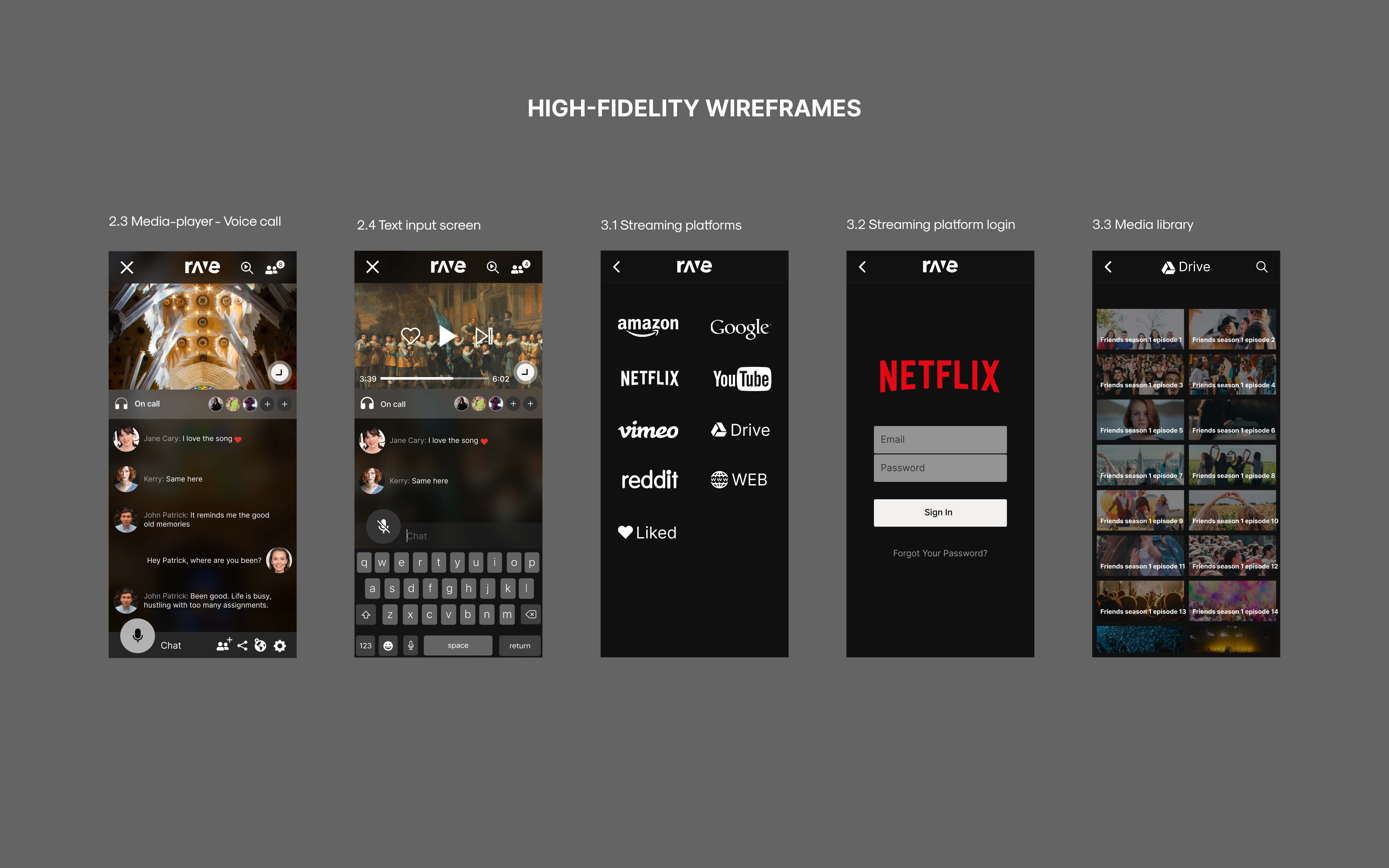
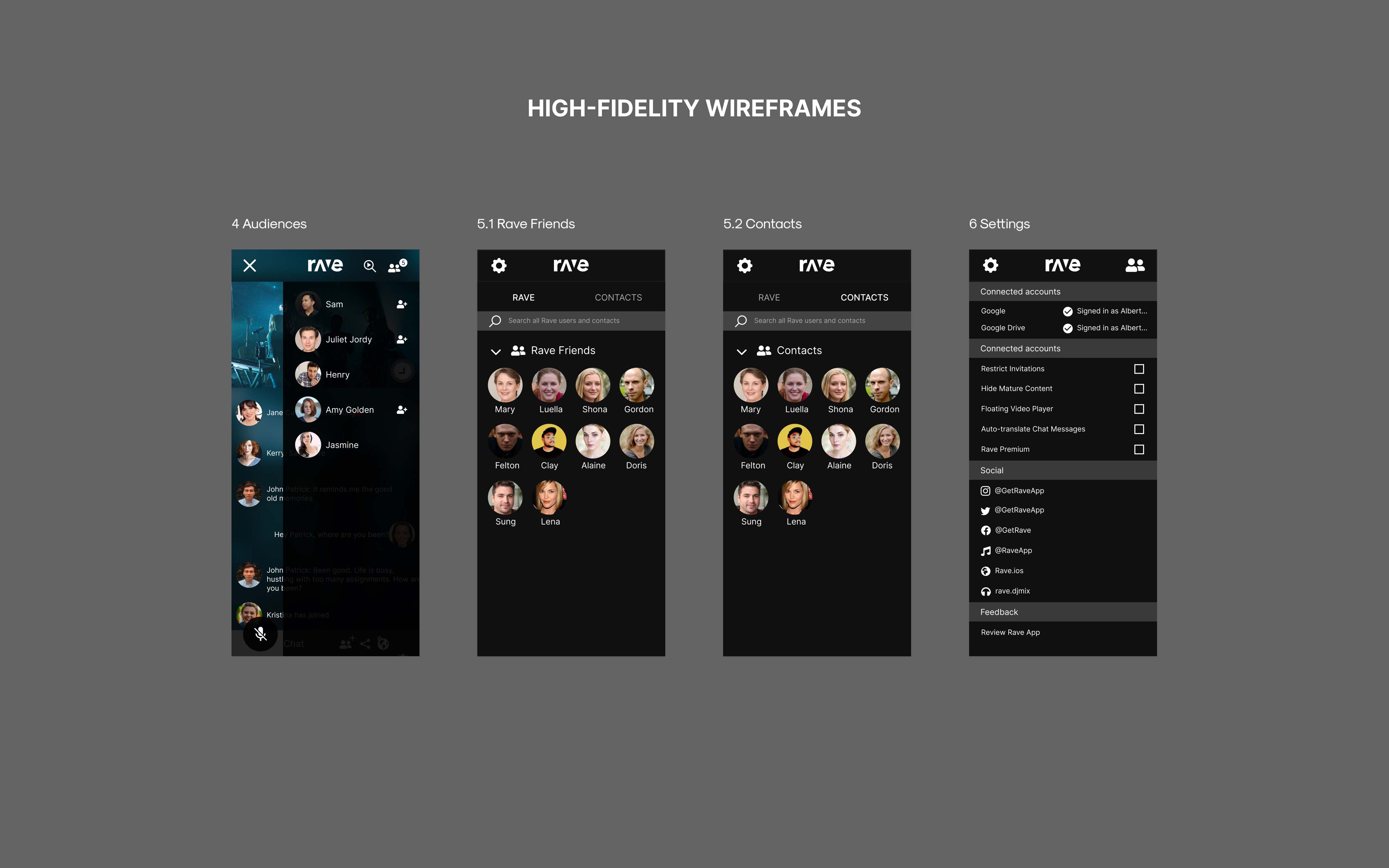
IA for the app is strategically organized to ensure easy access to essential features. Guided by user feedback and research, key features such as in-app voice calls and seamless integration with streaming platforms are prominently placed for easy access. Minimizing friction and enhancing engagement.
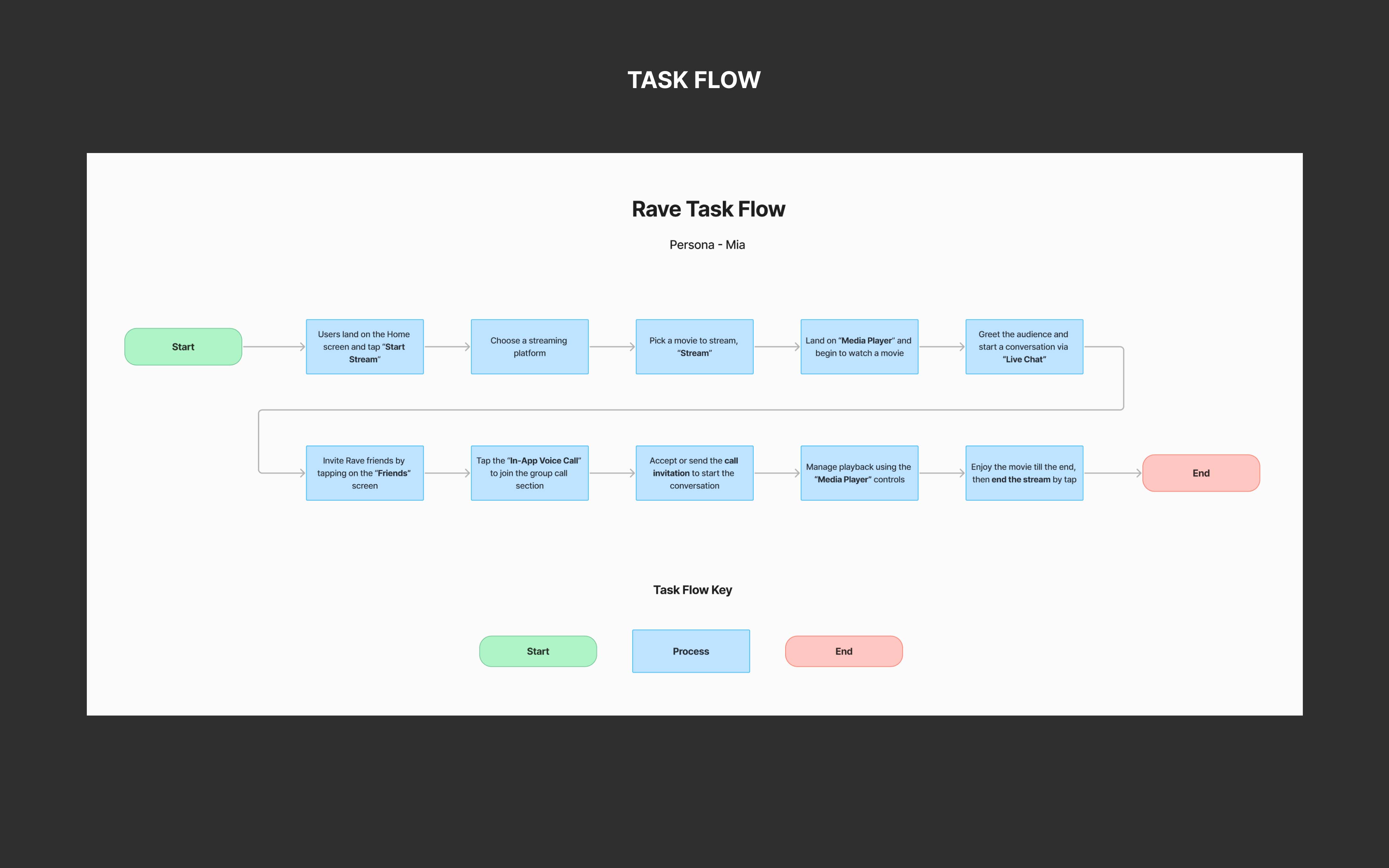
Task Flow
Mia desires a smooth process to start a stream and watch a movie with friends. The design focuses on simple pathways for movie selection, live chat, and inviting friends, allowing her to quickly create the ideal movie-watching experience.
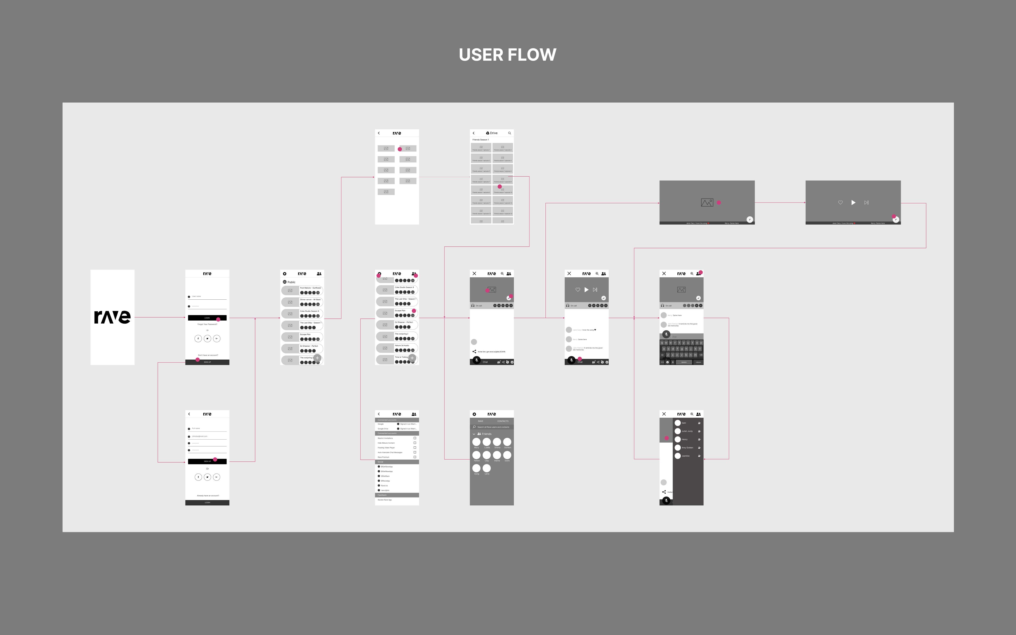
User Flow
The user flow is designed for clarity and ease, simplifying each step of the process. It minimizes unnecessary steps and enhances accessibility, enabling users to quickly set up and enjoy a social streaming experience.
Low-Fidelity Wireframes
By reviewing existing screens first, I identified what needed to be modified or added to align with the user flow and task needs. This approach helped me generate ideas quickly and address potential issues early on. These lo-fi wireframes then provided a solid framework for creating high-fidelity wireframes.

Prototype
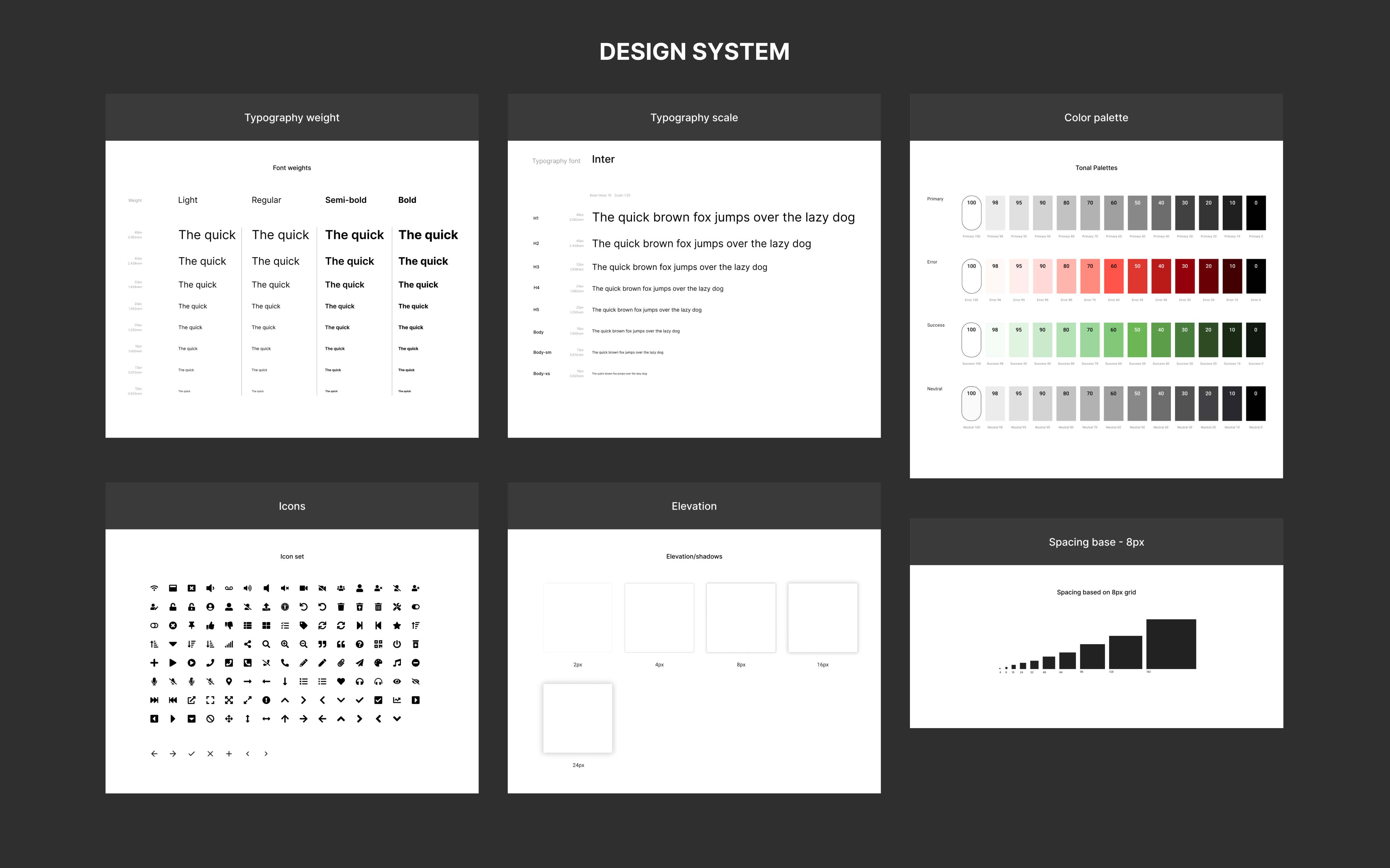
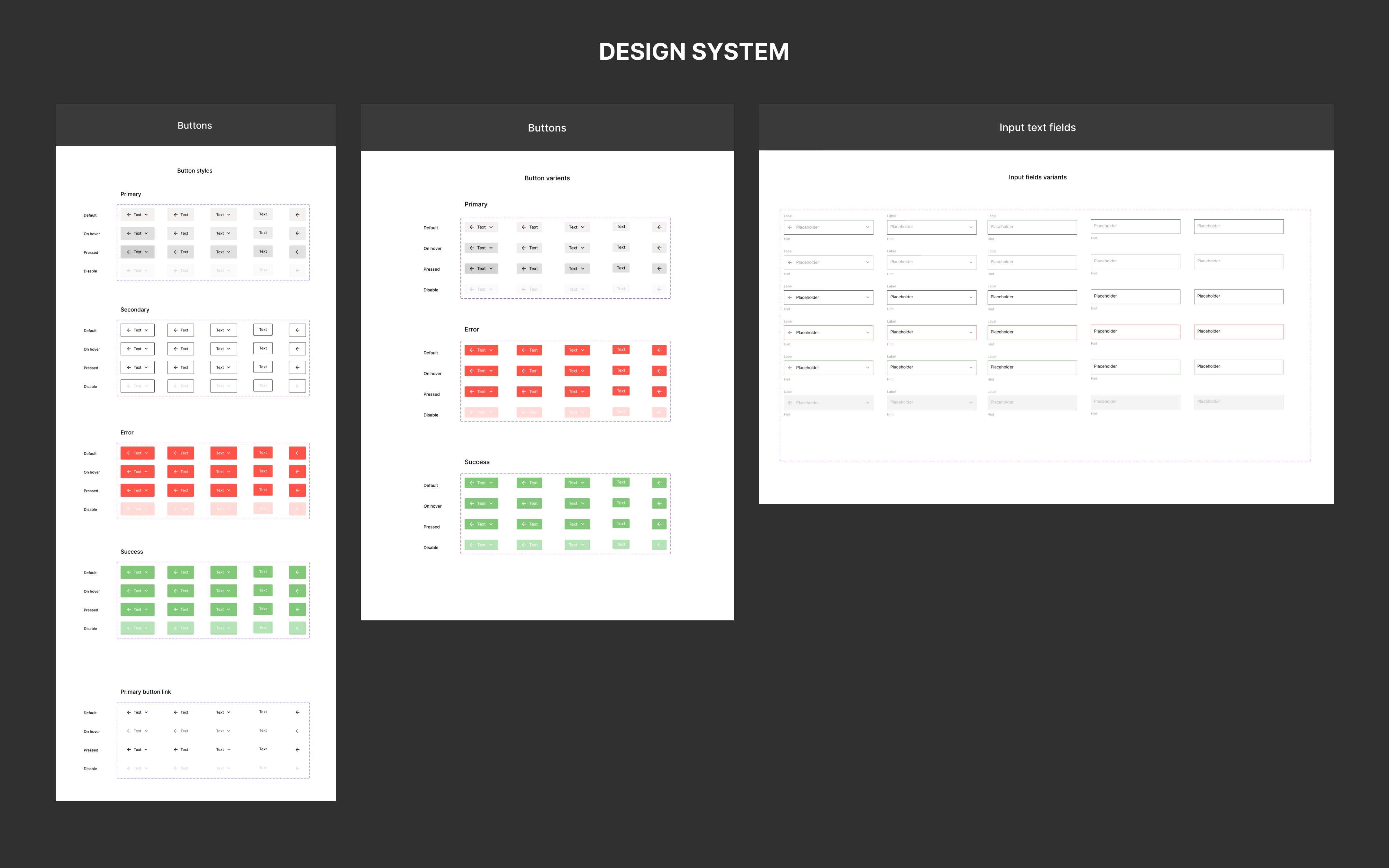
Design System
The app initially lacked a cohesive design system, which led to inconsistencies across different screens. To address this, I developed a comprehensive design system that ensures uniformity across the app.
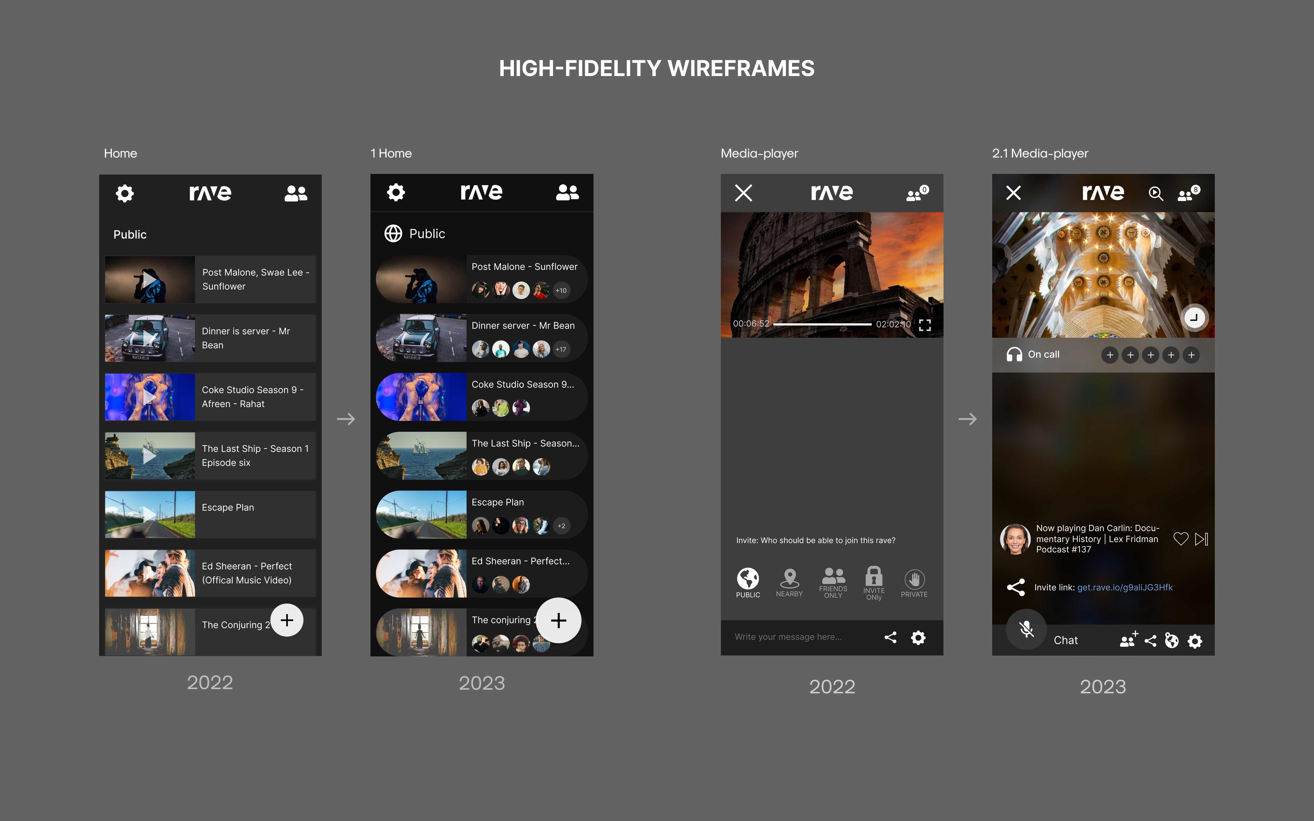
High-Fidelity Wireframes
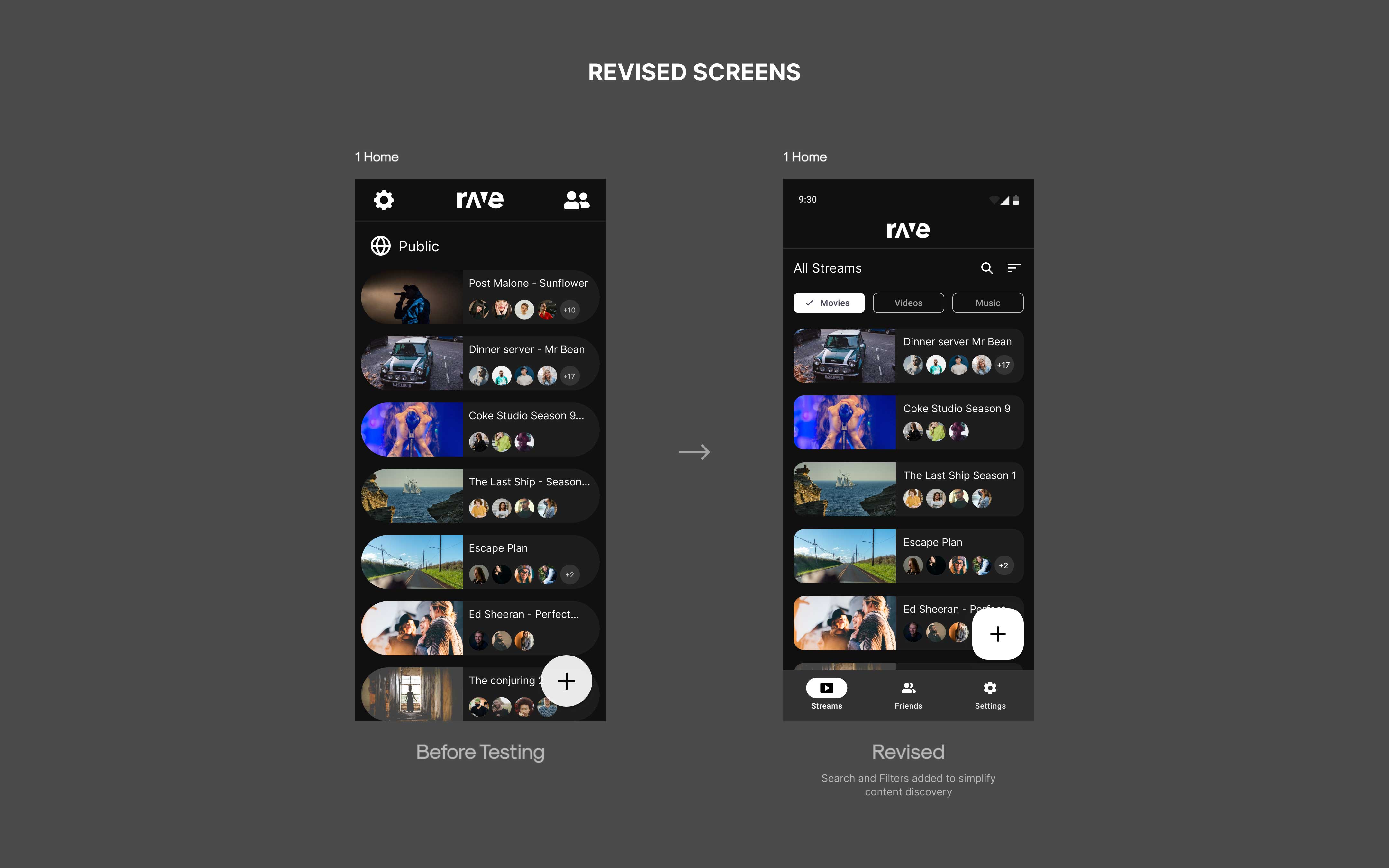
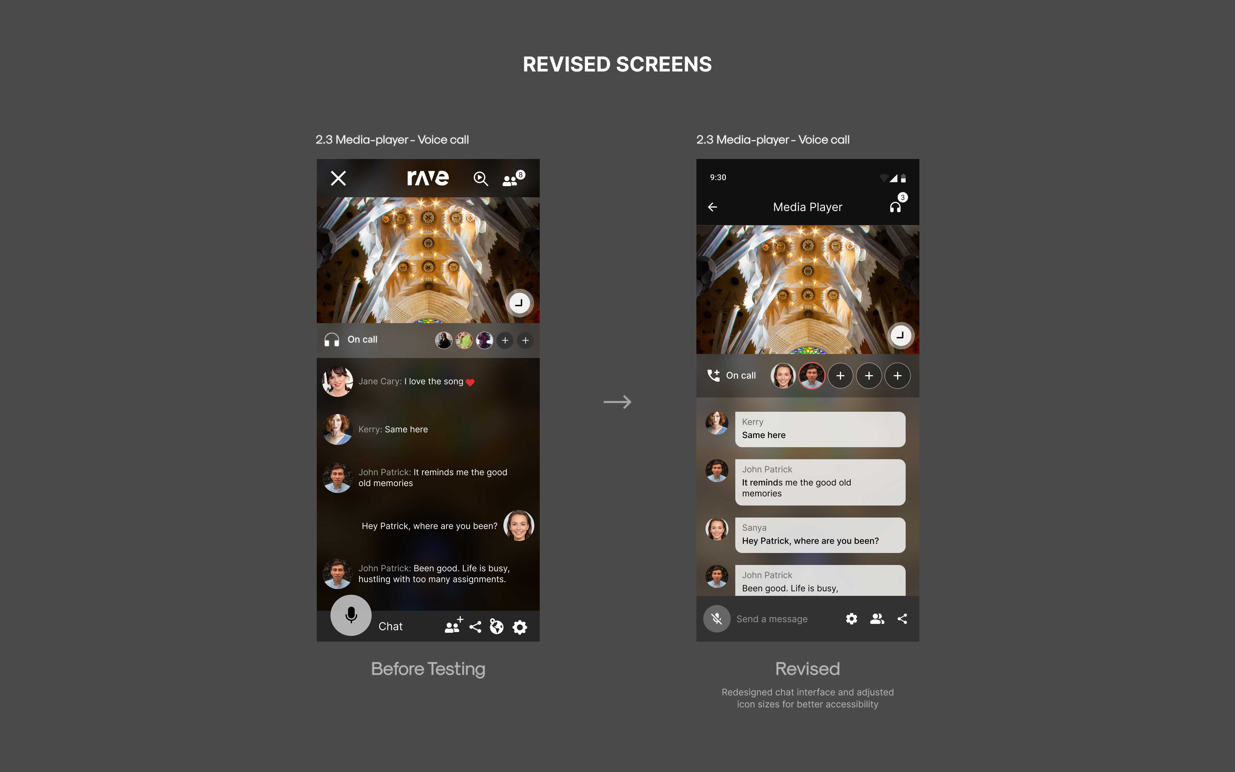
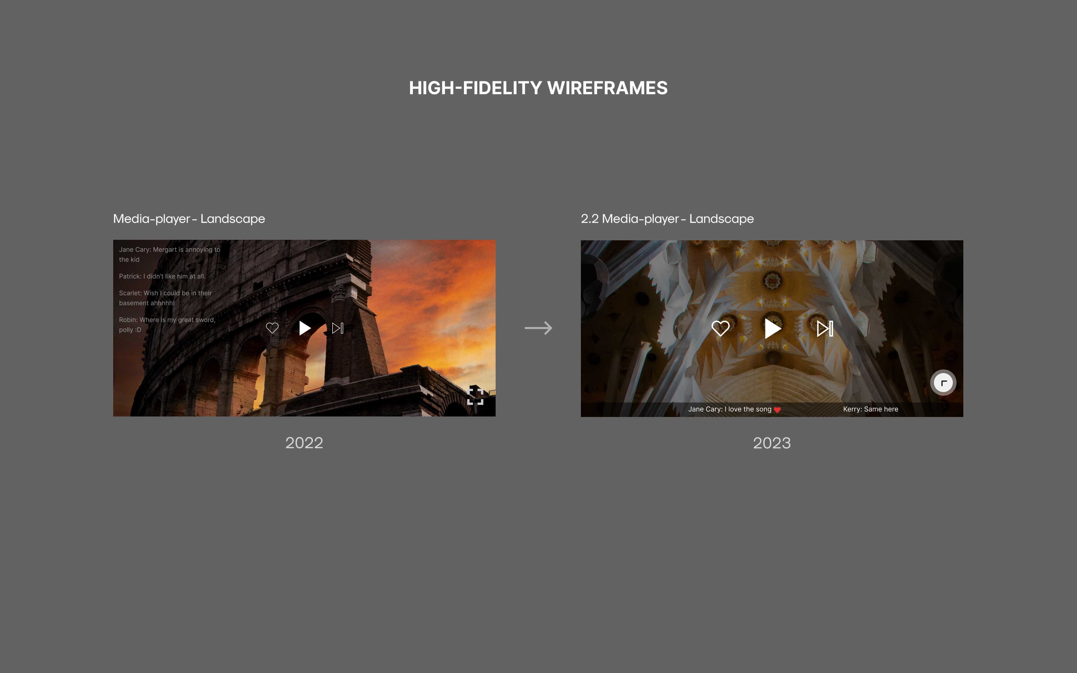
Based on insights gathered from user interviews, I redesigned the home screen to enhance clarity and shift the focus from a video gallery to a more intuitive streaming experience. The media player screen now includes an in-app voice call feature to address user concerns about connectivity.
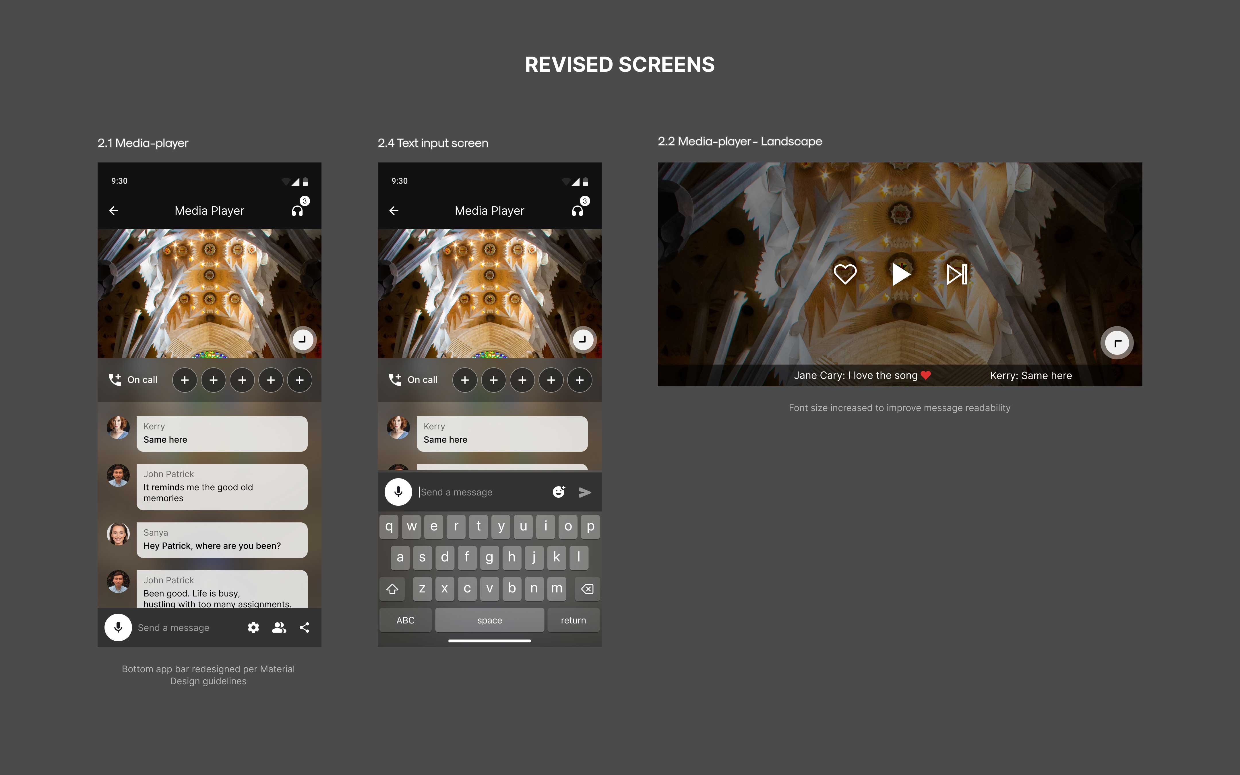
Additionally, I identified two distinct movie-watching patterns and redesigned the text overlay on the “Media Full Screen” to cater to active users, improving usability and overall engagement.
Test
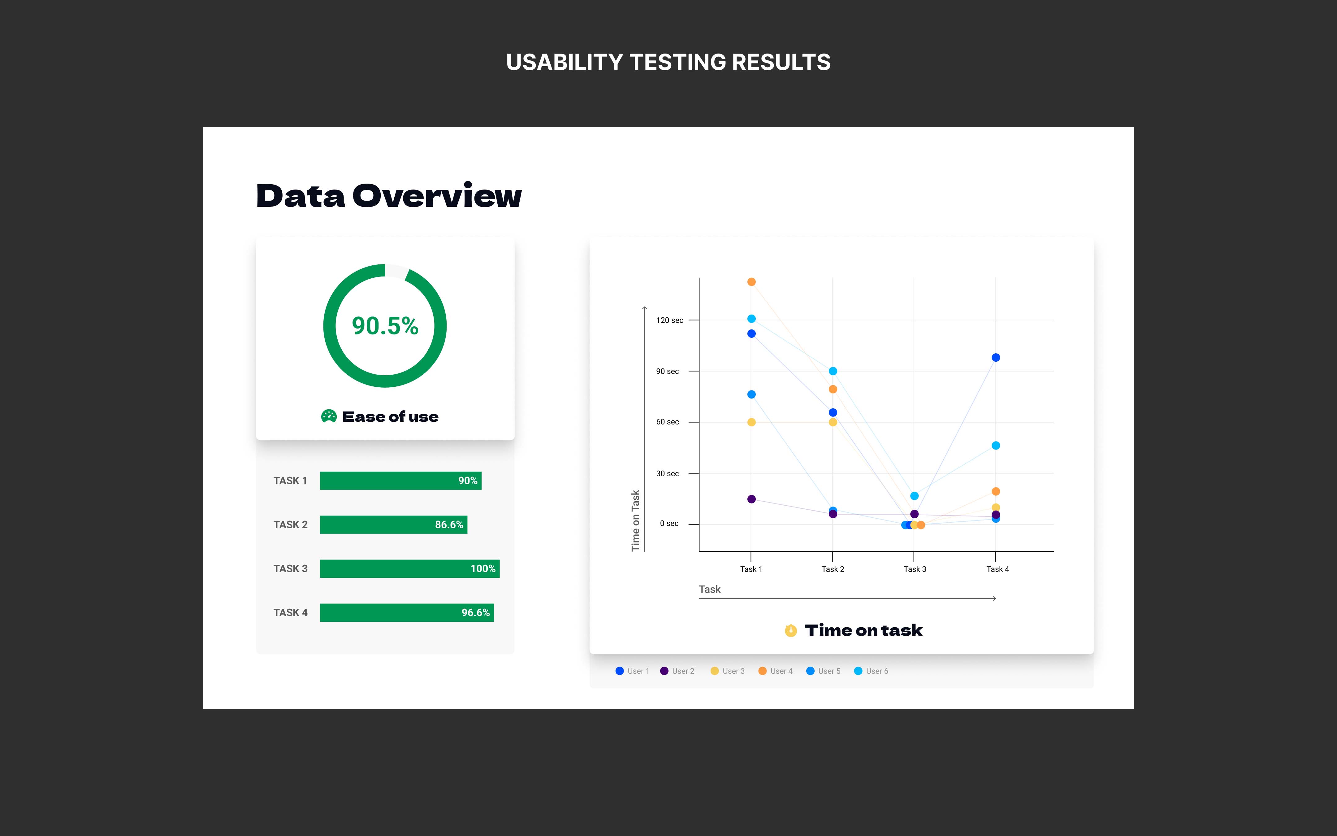
Usability Testing
Usability testing was conducted one-on-one with target app users to identify key usability issues. The session focused on real-time feedback observing user interactions and analyzing challenges faced during app usage.
Wins
- Users found the redesigned ‘Streams Screen’ easy to interact with.
- Navigation was generally clear and easy to use.
- The calling feature was intuitive, reducing the need for additional effort.
Opportunities
- Users struggled with navigation; adhering to Material guidelines would improve usability.
- Filtering streams was difficult; adding search and filter options would enhance the experience.
- Voice calling icons were hard to tap; increasing size would improve accessibility.
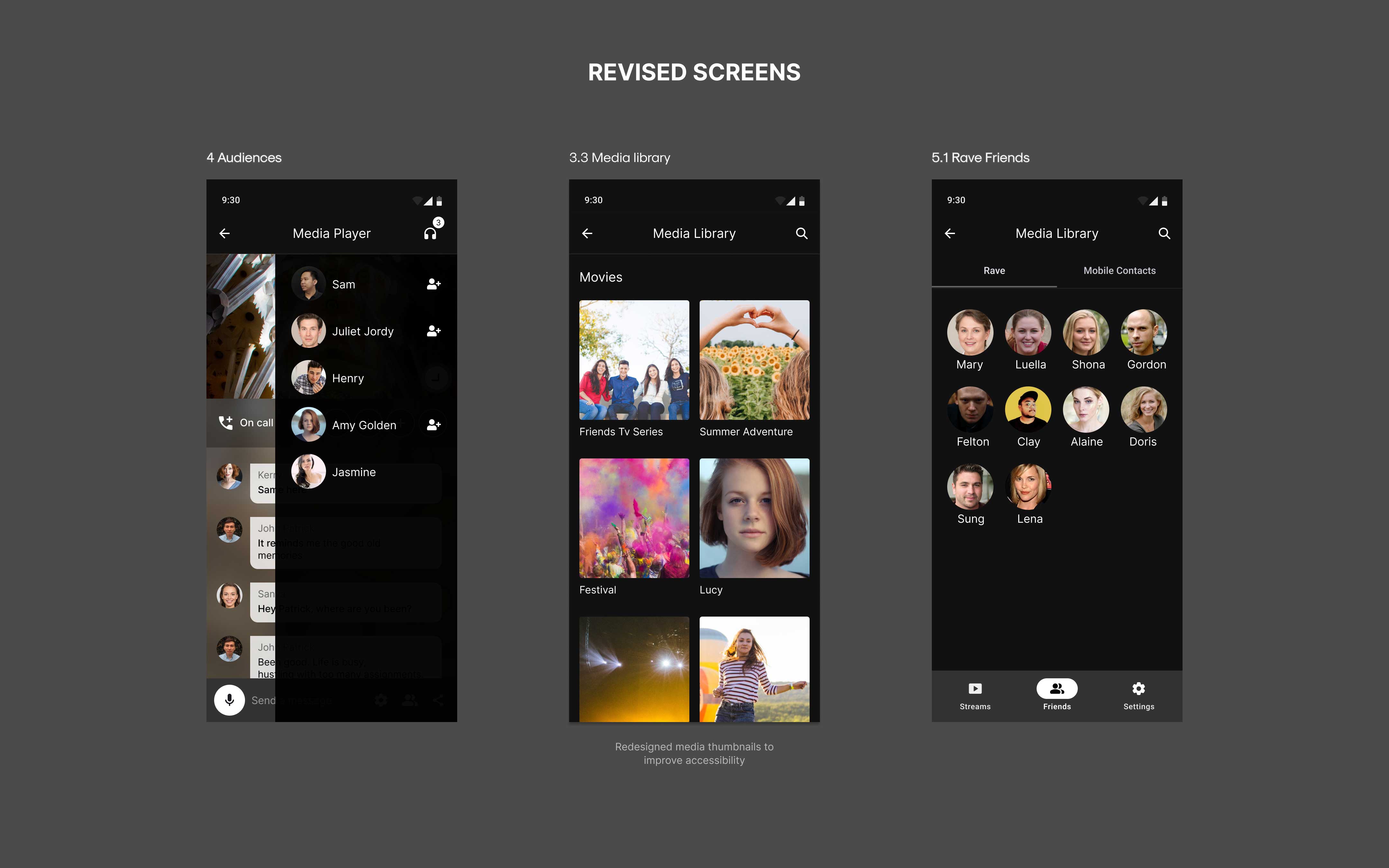
- Media library felt cluttered; simplifying the design would improve usability.
The Outcome
The redesign significantly improved usability and user satisfaction with key features, enhancing the movie-watching experience and establishing a cohesive design system.
Key outcomes:
- Connectivity workarounds decreased by 86%
- Average stream time increased by 120%
- Active user base grew by 35%